While some sites opt for mundane, run of the mill wording such as ‘continue,’ ‘okay,’ and ‘take me there,’ others take the time to develop language that’s unique, effective and irresistible. What exactly are we talking about? Read on for some powerful examples of call to action lines by brands getting it right.
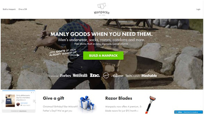
Manpacks – ‘Build a Manpack’
When you can speak the language of your customers you’ve earned a one way ticket to e-commerce success. While the concept of creating custom packs of underwear and razors may not seem overly exciting, the idea of ‘building’ something appeals to the intrinsic male desire to construct. When phrased as ‘Build a Manpack’ the call to action is strong, masculine and utterly appealing. Put simply, it’s nothing short of genius! Plus we love the arrow that subtly points out that thousands of other gents are already on the custom grooming box bandwagon. What man could resist?
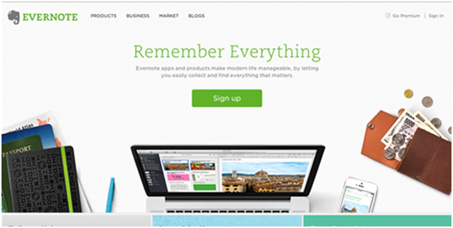
Evernote – ‘Remember Everything’
Let’s face it, who doesn’t want to remember everything? This clever call to action is more or less irresistible to users in search of the digital workspace service that Evernote provides. The green color scheme denotes balance and growth, both of which are hugely appealing to users burdened with information overloads.
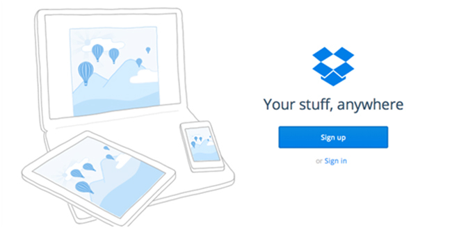
Dropbox – ‘Your stuff, anywhere’
Oh so cool and casual, this call to action is inherently appealing to the modern internet user. The use of the world ‘stuff’ makes the service seem wonderfully approachable while the simplicity of the design and vast presence of white space is ultra-easy on the eye.
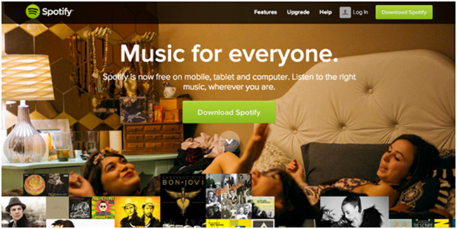
Spotify – ‘Download Spotify’
Here, Spotify has provided us with the perfect example of how a call to action can still be effective when placed over a busy background. Sure, there’s a lot going on at that all girls musical slumber party however the use of a lime green button, subtle 3D shading and corner duplicate ensures that users don’t miss the prompt to download the streaming software. The main lesson here is that busy backgrounds call for contrast and repetition.
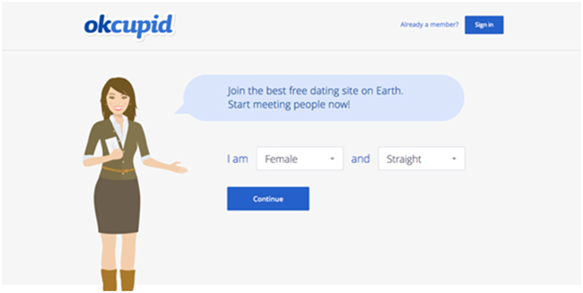
OKCupid – ‘Continue’
While the OKCupid sign up page seems a little lackluster at first, it’s actually embedded with brilliance. The experience is interactive and requires users to fill in their gender and sexual orientation before hitting the ‘continue’ button. This fast yet fun action engages from the word go and makes visitors feel as though they’re playing a game rather than responding to a call to action.
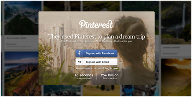
Pinterest – ‘Sign up with Facebook’
Ahh Pinterest. It’s a mastermind move to have used the world’s biggest social media giant to make the sign up process as fast and easy as possible. Users enjoy two options – sign up with Facebook or sign up with email. With its recognizable color and branded logo the first is far more aesthetically appealing. And not without reason! By encouraging users to sign up with their Facebook accounts, Pinterest can pull individual API data and use it to optimize the user experience. Sneaky yet superb!
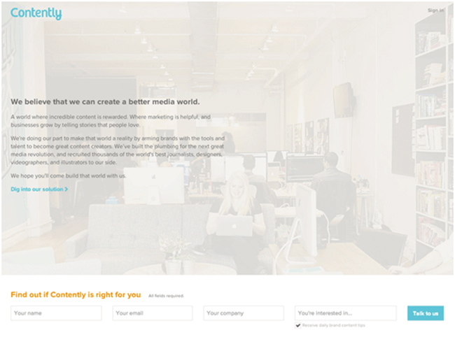
Contently – ‘Talk to Us’
This digital media goliath churns out some of the best content on the planet so it’s unsurprising that its call to action is suitably shrewd. After prompting browsers to fill out initial information, the site swaps bland and generic wording such as ‘submit’ for chatty, engaging language that doesn’t feel at all salesy. Very clever indeed.
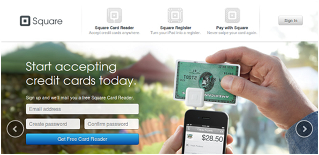
Square – ‘Get Free Card Reader’
Embedding calls to action with some form of reward is a sure-fire way to increase conversions. When signing up for Square, users happily swap their details in exchange for the free card reader as marketed in the call to action button. Note that the word ‘get’ is highly enticing and is very popular in calls to action.
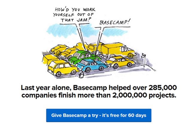
Basecamp – ‘Give Basecamp a Try’
The free trial offer is no new concept however Basecamp has reimagined the proposal with a casual, unintimidating tone that’s relaxed yet persuasive. It almost implies that if browsers don’t sign up they’re selling themselves short by not ‘giving it a try.’
Point Blank SEO - Be Awesome
Fun and exciting, this newsletter sign up suggests that if users don’t surrender their emails, they’re not awesome. It may be a little tongue in cheek but there’s no denying that it’s downright effective.
![]()