
Architecture types
The first thing to look at is how your site displays content across both desktop and mobile. This is important as it will affect how you choose to go on and optimise the site. There are three main ways of doing this:
1. Responsive
This is the recommended way to accommodate both mobile and desktop users on your site and is maybe the most future proof version. I don’t think anyone predicted tablets would be a thing before the ipad so having a system in place which is adaptable is always a good idea.
Responsive design is a CSS3 standard which allows the same content to display slightly differently depending on the screen size. If you grab the top of your browser on this page and drag it in to resize the screen, you’ll notice how the content shuffles around and the page still works.
2. Dynamically served content
The same URL can display different content depending on who is querying it. In the bad old days this used to be known as cloaking, where you would display one set of content to the user and another different set to the Google bot.
This is done using the user agent, which is part of the request your browser makes when it lands on a page. Your user agent contains information such as your operating system, browser type and version, and screen size.
Using the user agent the server can then serve different content for mobile and desktop. Of course this comes with the added complication of needing to update and maintain two separate code bases and sets of content for every page, as well as the technical difficulties in displaying the content. In addition, if a new device or screen type comes along you will need to add another set of code for every page.
3. Duplicate URLs
This final option really should be left as the last resort, as in nothing else will work and it’s this or the nukes option. Duplicate URLs involve having a separate site for mobile, usually placed on a subdomain, which a mobile user will be redirected to if they land on a desktop optimised page.
Whilst this does give the advantage of being relatively easy to deploy it can create some major maintenance headaches, particularly if the mobile and desktop versions of the site begin to diverge. You’ll also lose link value to the separate pages, instead of consolidating it on one URL.
Which architecture is best for me?
Responsive design is usually the best option. However, it involves having one set of content dual purposed across both desktop and mobile and that's significantly different from the other two solutions which allow you to have separate sets of content for both.
In order to decide which is the best solution to employ you need to assess your audience and understand your market. For example, we have a significant number of mobile users on the blog and the academy portions of our site, but far fewer within the sales sections of the site. Weighing up the options we chose a responsive design, knowing the same content will appeal to mobile and desktop users. However, this is not always the case.
Some sites are predominantly used on mobile, or a mobile user might require a different experience from the site. Mobile searches are usually more contextual, so relevant to where and when the user is searching. Also, the way people search is different on mobile - you'll get typically broader mobile queries and longer tail for desktop.
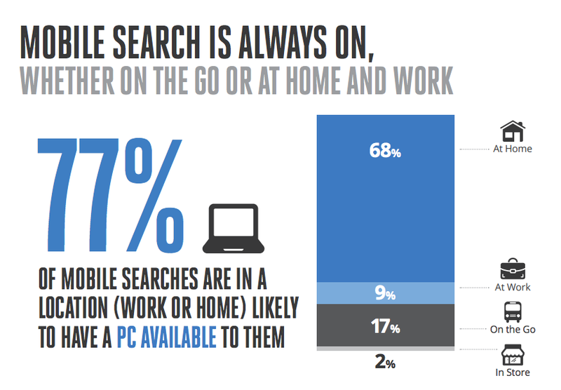
However, don’t fall into the trap of thinking that all mobile search is on the go, far from it. In fact most mobile searches are made at home or at work and take place in the afternoon and evening. So we're often searching on mobile out of convenience rather than necessity.
 So if your content is purely informational, like our blog, it’s unlikely to need vastly different mobile optimisation.
However the content which may need to be significantly different for mobile falls under the latter 3 categories of what Google terms ‘micro-moments’. These are the high intent searches likely to result in an action immediately after. Or in other words at the end of the buying cycle.
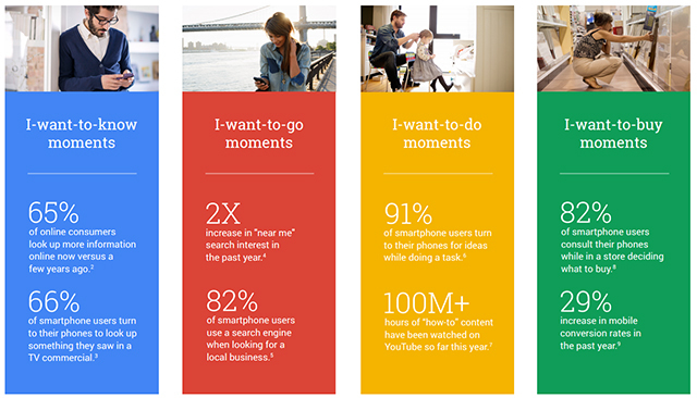 Those wanting to ‘go’, ‘do’ or ‘buy’ are going to be taking an action based on that content and that’s where you may need to serve content in a different way to be more effective for mobile users.
Mobile first vs graceful degradation
Do you start with the mobile version of the site and then add to this to create the desktop version, or do you take a desktop version and slim it down to fit it into mobile? Which of the two approaches you choose should be driven by the audience you're aiming for and the content you're creating.
If it’s a site which is going to rely heavily on mobile users, then mobile first should be the way ahead. Where this is the case, depending on the content, it may be easier to use a solution such as dynamically served content so the mobile version can be different from the desktop version.
Mobile friendly features
Some features don’t work well on desktop but are great for mobile, such as click to call. Optimising content with mobile only features may mean you need to look at how that content is served, but it can be well worth it.
Clumsy thumbs
Mobile users don’t have the luxury of a mouse and keyboard. It’s fingers and thumbs. So buttons and menus need to be big and clear. This may mean hiding menus behind ‘hamburgers’ or cogs. This way they don’t take up screen space when not needed, but when they are they can be full width.

Take a look at our dedicated article on how to do mobile web design for more information on dealing with those fumbling thumbs and check out the Google tool for mobile design optimisation:
https://search.google.com/test/mobile-friendly
Keywords and content
If you want to capture those micro-moments, it’s all about intent. The user is landing on the page with a certain amount of momentum. Creating something too informational or text heavy may well lose you clicks.
This ties into the broader nature of mobile searches, where more content is needed to capture longer tail keywords and searches. Dig into your current rankings, and if your ranking software allows it run a report on desktop vs mobile rankings. Have a look at the type of keywords used on mobile and which micro-moments these best fit. You can optimise the relevant pages towards these.
Check out our guide to micro-moments for more information and further reading on how exactly to optimise for the different types of micro-moments.
AMP
AMP is a mobile only way of serving content using Google. It’s tailored towards news and informational content and you likely won’t find a quicker way of serving your content to mobile users. We've created a great introduction to AMP as well as an in-depth guide on how to add AMP to your website.
Page speed
Some things are just good practice, and whether it’s responsive or mobile specific and no matter how it’s served, you’ll want to look at these. Luckily there are some handy tools out there to help.
https://developers.google.com/speed/pagespeed/insights/
https://testmysite.withgoogle.com/intl/en-gb
Both these tools are great for getting more information on why your site might be running slowly. But if you really want to get serious about page speed then use our awesome guide to optimising site speed for more information.
So mobile or desktop?
This is all best approached top down, by deciding how important mobile searches are to you and the compatibility of your content with both desktop and mobile. Taking a mobile first approach will likely lead to different design, content and optimisation decisions. Or you may decide to simply adapt and tweak existing content and code.
Whichever approach you choose to take, make sure it’s test driven. Optimise some content, see if it works and then move on to other content. Understand the effect it has on your site revenue and use that to decide how much to invest in it. However, it’s worth factoring in that mobile is only set to grow. This is especially relevent if you are targeting emerging markets where mobile adoption is huge and is driving massive growth in mobile internet use over desktop.