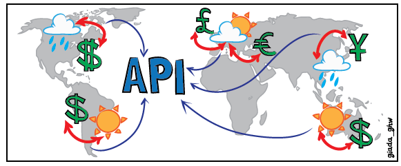
The Wordtracker API gives you near instant insight over 10 billion searches and 350 million keywords across more than 200 territories. That’s a whole lot of data at your fingertips and you can do some rather interesting things with it...
This article is all about some of the more curious connections you can make with the Wordtracker API. It’s not a really scientific exploration of the data, but it is fun. Although I’m no data scientist, I have spent years looking at search data and analytics, and I do know about insight. I want to show that anyone who can use a spreadsheet and the API or Keyword tool can start digging through the data and finding some uniques insights - so lets get digging and see what we can find!
I’ve started off by looking at some of the more obvious stuff, for example how about seeing some information for the top counties by search volumes
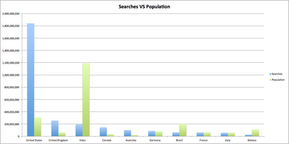
This is as we would expect, and we can see that more economically developed countries with higher populations perform more searches. Note the spike from India with the very high population, giving a search per person of 0.16 which is 92% lower than the average from the top ten of 2.28. For comparison the US comes in at 5.9 searches per person.But we don’t need to stop there. For instance let’s have a look at the number of searches per person VS life expectancy:
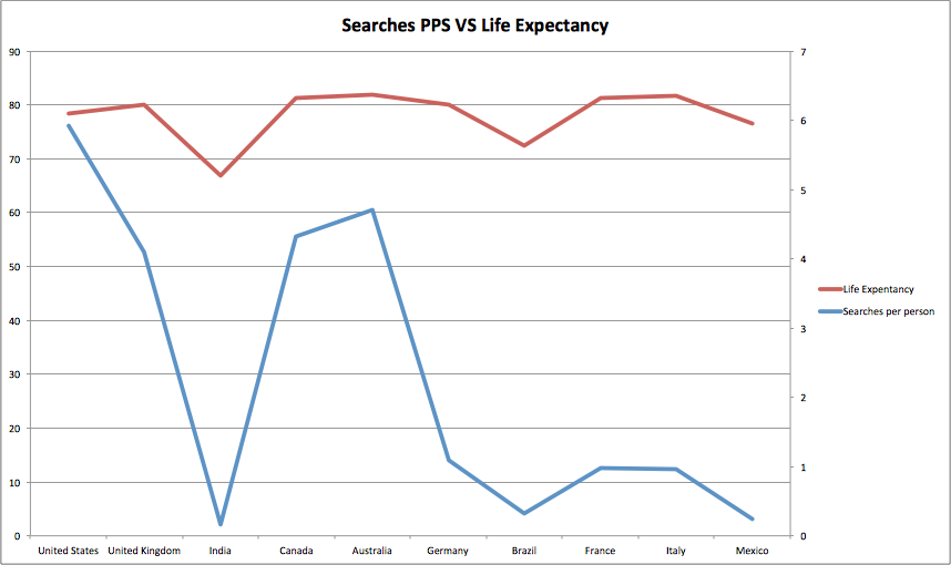
This looks to have some kind of correlation as both lines appear to follow the same trend. Of course what I’m not saying is that somehow by making more searches you’re more likely to live longer. I’ll leave it my friends correlation and causation to explain why this, and just about every shock study I’ve read about in the paper, would be wrong.
So far this is all kind of as expected. Economic development and Life Expectancy are correlated, and countries with better economies are more likely to have a higher percentage of internet users and so the number of searches per person in those countries will be higher. Let’s not make that assumption though, when we can actually test it.
And while we’re at it what else would be interesting? How about the weather, emissions, inflation, GDP and if all these things relate to keyword stats, if at all?
To answer these kind of questions I need to be a bit more rigorous than just chucking numbers on a graph and looking for where wiggly lines match. First of all we’re going to need a bigger sample. As I want to be using bigger numbers I’m going to stick with using the top countries by Searches, but this time go for the top 50. We’ve got over 200 territories which make up our data, so there’s plenty of choice. These are all accessible via the API by the way.
We also need a way of mathematically spotting correlation between the two data sets. The way I have chosen to do this is by using Pearsons r. This is a way of finding positive or negative correlations between data sets, returning a score of 1 for a positive correlation, 0 for no correlation and -1 for a negative correlation. The closer towards 1 or -1 then the more likely there is a correlation. As I am using a relatively small data set of 50 countries I am looking for an indication of correlation of greater than 0.5 in order to be statistically significant. I’m not a mathematician so constructing confidence intervals and permutations tests is a little beyond my skill set. If that sort of thing is very much your bag please do feel free to rip my methodology to bits in the comments though :)
So first off there is Searches against GDP, or Gross Domestic Product. It seems logical that there would be a correlation between the two, so let’s have a look:
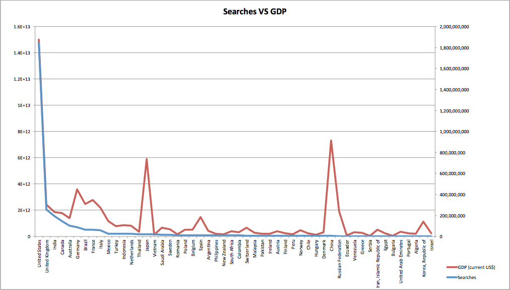
The higher number of searches on the left decline as we move right, as does the average GDP. Remember this is about looking at the broad trends, so try and look past the spikes and at the overall behaviour. Pearsons r backs this up with a score of 0.83, so well above our 0.5 threshold.
So where else do we see correlation like this, well looking at CO2 emissions against searches per person we see that there is a correlation coefficiant of 0.55, which looks like this:
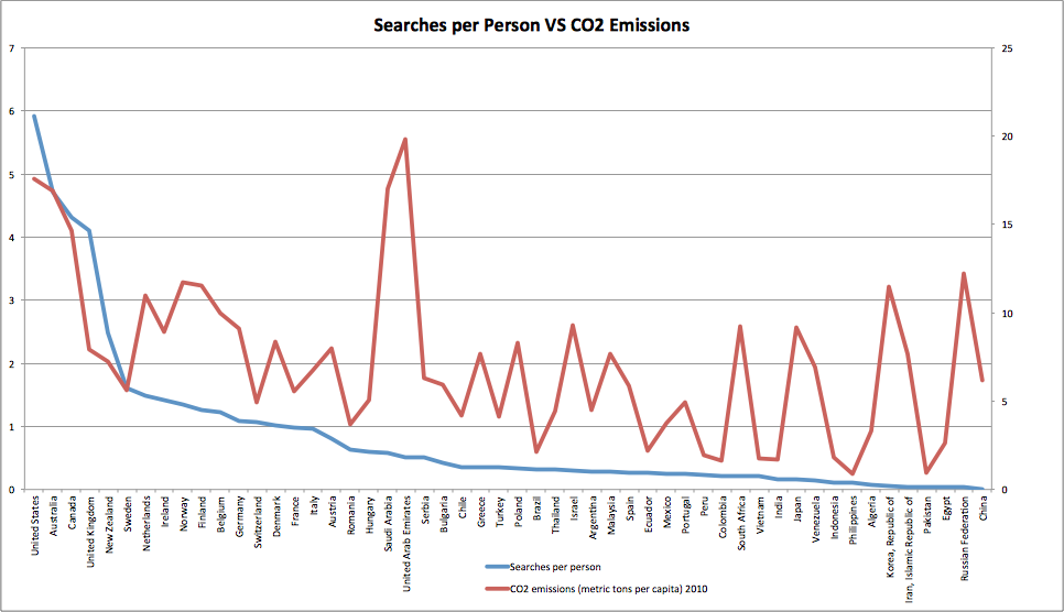
This tells a similar story, with searches and and CO2 emissions both declining from left to right. The higher the number of searches per person then the stronger the correlation appears to be. So in the countries where individuals spend more time making searches they have a higher amount of emissions per person.
Keyword trends
So far I’ve been looking for broad correlations on a country by country basis. Now I’m going to drill into data for one country at a time and see if I can find any correlations between the terms people search for and other real world events.
Here’s my first example, I’ve looked at the peak precipitation (rainfall) for a given week within the UK and compared that with the number of searches for umbrella:
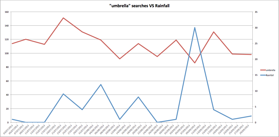
This looks to have some pretty good correlation between the two, as you might expect. There is a spike in rainfall which is not reflected, however this is an extreme peak and could well be an anomaly in the data. One of the restrictions here is that I am using weather data from a single weather station (Heathrow Airport, London) so it’s not truly representative of the weather across the UK.
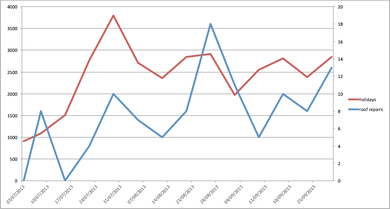
Comparing a few other searches starts giving some interesting results, for instance “roof repairs” and “holidays”:
In the graph below, I've combined rainfall, holidays and roofs. The relationship between these is clearly the weather, when it’s raining you’re thinking about holidays, and well fixing that leaky roof!
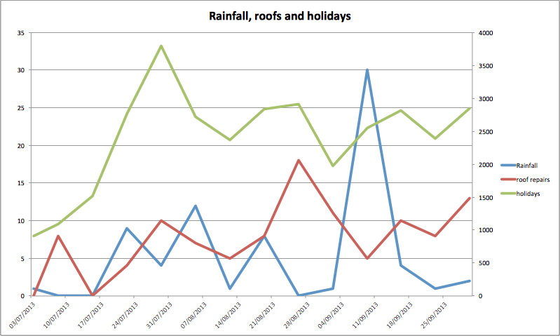
What gets really interesting is when you time shift the searches against the rainfall data, so you push the search data forwards by a week. Then you start getting a graph that looks like this:
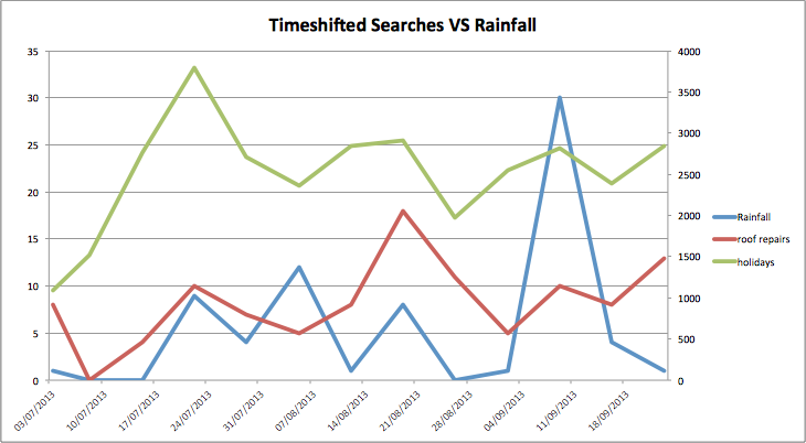
Looking at the numbers again we get a Pearsons r for Rainfall VS “holidays” of 0.27 but when we timeshift this to look a week ahead against rainfall we get a score of 0.32. This backs up the idea that rainfall has a knock on effect on future searches.
So what does all this mean
I’m not a mathematician, scientist or any kind of data expert. I am however an SEO and have been working in Search for long enough to understand the basics of looking at sets of data. What I see here is an interesting start, and with more data points we can draw firmer conclusions. We are now adding data to the API at a rapid pace and will soon have more available.
I’m really excited about the opportunity to see large scale search data like this available through a robust API. At the moment other data providers are busy clamping down on what’s available and making it harder and harder to gain proper insight into search behavior. I’m extremely proud to be part of a team that’s doing the opposite. There is so much insight to be gained from looking at this, not just for your Search and Marketing campaigns, but for much wider applications.
We don’t normally allow applications to the API for personal / non commercial use but we are very interested to hear from people who have some great ideas for how we can use the data or are looking to create research projects based on it. We want to work with you to see what we can find.
I hope this post has inspired you to start looking, we are soon going to be adding the past data to the Keyword Tool as well so that everyone can access it, meaning you will soon have no excuse to get your big data hat on and start digging!