
Mobile design is the present and the future. Whether you have a web designer or create your own website, with Google’s continuing push on mobile it makes sense to focus efforts on getting your responsive website right.
To win on the web and ensure your shoppers don’t abandon their carts on your site, you should know what makes a great responsive design.
There are five criteria that a mobile-friendly site must meet in order to be considered responsive. It’s important to know what these five areas are before identifying the common mistakes even smart developers make that could be costing you sales.
What are these five criteria? They are that a website should be:
- Effective
- Efficient
- Engaging
- Error tolerant
- Easy to learn
Let’s take a look at each one in turn.
1. A great mobile-friendly site must be effective
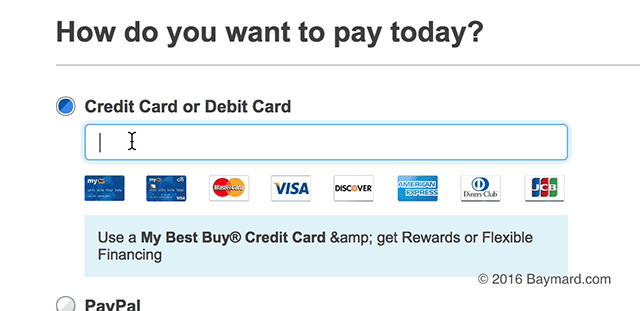
Your website should help mobile users complete their goals with a high degree of accuracy. For example, a credit card field should only accept a valid credit card number. This helps reduce data entry errors and helps users to complete tasks quickly.
The language used to describe your product or service should be clear and simple. A sixth-grader should be able to read and understand the content on your website.
2. A great mobile-friendly site must be efficient
It’s important to note that effectiveness and efficiency are two different things. Above, we looked at effectiveness. Effectiveness is helping people achieve their goals and complete tasks on your website no matter which device they’re using. Efficiency is about speed. How fast can customers find what they are looking for on your website? How many clicks do they have to make before achieving their objectives on your website? With an efficient mobile design, customers find what they are looking for in less time.
3. A great mobile design must be engaging
An engaging design encourages interactivity.
Engagement means visitors are using your website. Visitors are adding products to their carts. They are buying.
They are talking about the beauty of your site on social media. They are watching your product videos.
They are writing customer reviews. They are using the live chat option on your responsive site.
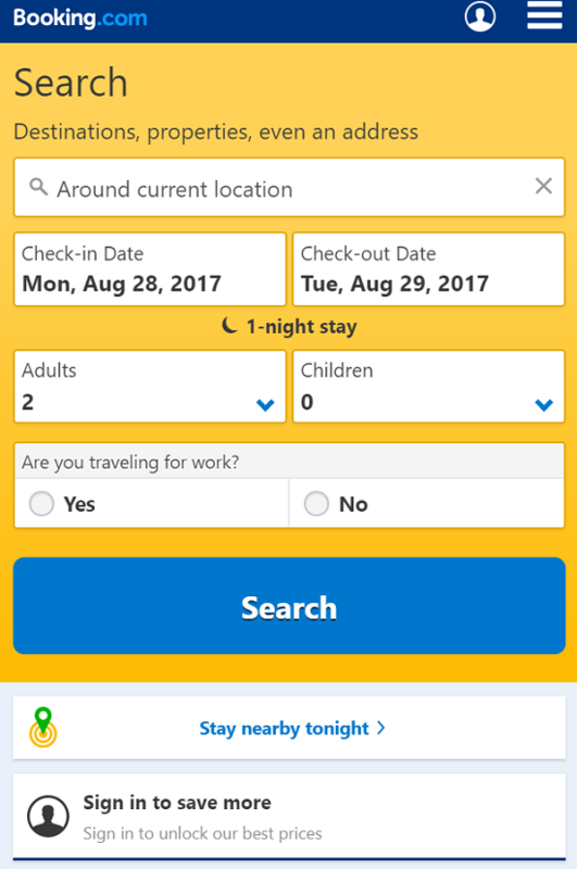
When you see all these happening on your website, it indicates your design promotes engagement. In this Booking.com example, the design encourages users to interact, with easy form fields and a useful stay nearby function.
4. A great mobile design is error tolerant
Let’s say a prospect lands on your website and by mistake, clicks on a category that isn’t related to what he/she is looking for. Your site should be designed in such a way that visitors can easily find their way to the right page with easy navigation or a logical breadcrumb structure. The design should present visitors with options to go back and start again or reset.
The design should assume visitors might do something you don’t expect.
5. A great mobile design is easy to learn
The best design practices work for a reason. Your website design shouldn’t look too dissimilar to other sites in your industry. Its design could also look like the most popular websites people visit and use every day.

Sites that look familiar are easy to learn. Visitors would know where to find the things they need.
The navigation should sit at the top or left so it’s easy to find. Buttons should look like buttons.
Common design mistakes
Now we know what the pillars of a great responsive design are, let’s identify the common mistakes even seasoned web designers make.
Smart developers have years of experience under their belts. But that doesn’t mean they won’t make any of the mistakes you’ll learn below. It’s your duty as a business owner, entrepreneur, or manager to question anything that could cost you sales.
1. Too much text content
Mobile screens are small compared to desktops. Therefore, mobile text content calls on users to scroll a lot more than they would need to on a desktop or laptop.
Too much scrolling due to large chunks of lengthy text can be frustrating for mobile users.
Long text content also takes too much time to consume.
If the complexity of your product or service calls for a lot of text to explain its benefits, features and all the other key points a prospect needs to know, you should consider replacing the text content with a video. If an image is worth 1,000 words, then a one-minute video is worth 1.8 million words according to Forrester Research.
For example, Basecamp could have written lots of text to explain how their product works. Instead, they created a short, two-minute video for their visitors.

Web users love videos. In fact, studies show that adding videos to your landing pages can increase conversion rates by as much as 80%.
You probably know more about your product and industry than most web designers or developers do. Therefore, you should know what type of content will work best for your business and its customers.
2. Complex navigation
A great responsive navigation helps mobile users to find what they are looking for on your website without confusion. It also eliminates unnecessary clicks to the wrong pages.
Good navigation leads customers to the most important information on your site.
Failure to plan and design the navigation correctly could result in lost sales. Poor navigation and lack of a clear breadcrumb can also alienate customers and potential customers. Work closely with your web designer and developer to negate this potential stumbling block. Don’t assume that they are smart and know instinctively what style of navigation will work for your particular design. Collaborate. Be aware of the reasons behind their decisions.
The below image by the Nielsen Norman Group, a user experience (UX) consulting and research company, shows two structures of navigation.
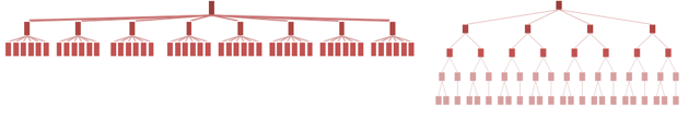
Amazon is a good example of the second style. It has millions of product pages on the website, but just four links in the mobile navigation, namely “Departments,” “Prime,” “Video,” and “Music.”

Amazon mobile navigation is well thought out. Despite having millions of pages on the site, the team at Amazon decided to put only four links in their home page navigation. There’s no doubt they did this in order to make their site navigation much simpler.
Your navigation should be simple too.
You probably don’t sell up to 1,000 products or services, or maybe not even 100. So, it should be easier to create a simple navigation with fewer links, making it effortless for your customers to find exactly what they’re looking for.
3. Slow website loading speed
If your website is slow on mobile,you may want to blame your web developer. Even smart developers are guilty sometimes of sacrificing performance for beauty.
You don’t just want your website to look incredibly beautiful however. You also need it to load extremely quickly.
A few extra seconds in the real world may not mean anything, but for mobile users, it can feel like an eternity and will result in higher bounce rates.
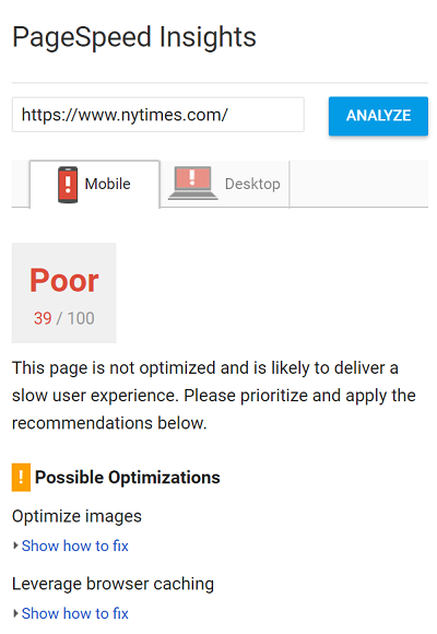
Test the loading speed of your website using Google’s PageSpeed Insights. You could also use a tool like GTmetrix to check your site’s loading speed.
According to Google’s PageSpeed Insights, the New York Times site is very slow on mobile.
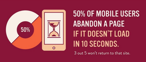
This is bad news for the New York Times, with research showing that 50% of mobile users will abandon a page if it doesn’t load in 10 seconds. 3 out of 5 will never return to that site.
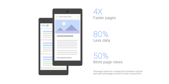
Sites that are 4x faster will enjoy 50% more page views according to Google.
There are lots of slow websites made by smart web developers with years of experience.
If you’re really serious about keeping your customers happy and growing your business, you should be concerned about your site’s loading speed. Ensure that you’re tracking it every week or month using any of the tools mentioned above.
4. Hiding important content
Most web developers are guilty of hiding important content because there just isn’t enough space for it on mobile.
Excluding important content from your site’s mobile version while having it visible on the desktop version is bad practice.
For example, let’s say your site’s desktop version has your business contact information in the footer, and the mobile version doesn’t have the same details. Potential clients might have visited your site on their desktop device and later decide to recheck it on mobile, only to miss the important information they were looking for.
If something is important and visible on your site’s desktop version, it should also be included in the mobile version. That way, your site will have a consistent look on every device.
Double check to ensure that nothing is visible on desktop that isn’t on mobile, and vice versa.
5. Too little negative space
Negative space (or white space) is a portion of your web page left blank or empty. It could be the space between graphics, columns, images, text and other elements in your mobile design.
Web users associate the presence of lots of negative space with elegance and simplicity. If there is little or zero negative space on your mobile design, ask your designer or developer why.
Don’t be afraid to leave large spaces empty on your website. Deliberate white space lets you create a strong focus on your message and gives each element enough room to breathe.
If you’re familiar with Google, you know how important white space can be to help visitors focus on the action you want them to take.

Your site’s negative space doesn’t necessarily have to be white. It could be any color as long as it emphasizes your messages.
Your web developer may be trying to impress you by cramming your mobile design with everything you asked for. Asking for everything could make the developer sacrifice negative space, but without enough negative space, your mobile design could appear too cluttered and be filled with distractions.
Negative space is very important on mobile in particular, as it draws people’s attention to where you want them in spite of the small screen.
Selling on a messy page is extremely difficult - you could be losing out on lots of potential sales.
Final thoughts
Don’t let your chosen web designer or developer handle everything just because they are smart. You need to be involved in the decision-making process too. Communicate your needs to the team and make them aware of the mistakes you want to avoid.
Now you know how to instruct your web designers and developers to create a user friendly mobile site that increases conversion and sales for your business.
Have you had experience with a web developer - good or bad? Tell us about it and what you learned in the process in the comment section below.