Google’s move last week to add favicons to search results on desktop (extending the new look from mobile) has resulted in a renewed focus on favicons. In this article we’ll look at tools and resources to help you create and add a favicon to your website, and also examine whether Google is further blurring the lines between paid and organic results.
Creating a favicon
A favicon is an extension of your branding and helps your website look professional. You should keep the same favicon on all your pages for consistency.
Google provides help on adding a favicon and also the following guidelines on your favicon being displayed in the search results (it’s not guaranteed):
- Both the favicon file and the home page must be crawlable by Google (that is, they cannot be blocked to Google).
- Your favicon should be a visual representation of your website's brand, in order to help users quickly identify your site when they scan through search results.
- Your favicon should be a multiple of 48px square, for example: 48x48px, 96x96px, 144x144px and so on. SVG files, of course, do not have a specific size. Any valid favicon format is supported. Google will rescale your image to 16x16px for use in search results, so make sure that it looks good at that resolution. Note: do not provide a 16x16px favicon.
- The favicon URL should be stable (don’t change the URL frequently).
- Google will not show any favicon that it deems inappropriate, including pornography or hate symbols (for example, swastikas). If this type of imagery is discovered within a favicon, Google will replace it with a default icon.
16x16px is tiny, so you need to be careful not to end up with a blurry blob or an indistinguishable block of colour...

Single letters work well, with strong contrast between the colour of background and letter.

![]()
For those of you who have a WordPress site, their guidance is on creating and installing a favicon is here, and Yoast SEO also has a guide to changing your favicon in WordPress.
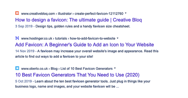
There are plenty of good tools around for creating favicons. Oberlo has a guide to 10 of the best.
Getting it right, or wrong…
If you have strong, recognisable branding already, then it should be easy. Instagram and eBay are instantly recognizable...


… but it’s not a given. The BBC has enormous brand recognition but their favicon is hard to make out.

An object illustrating your brand or line of business can work well...

...but not if it's not not an easily identifiable object, and doesn't contrast enough with the background.

Blurring the lines?
Google's move has not been universally welcomed, with many noting that the new labelling for Ads and the introduction of favicons is further blurring the lines between paid and organic search results. An analysis by Yard, following the introduction to mobile last year, concluded that the new look was negative for users in terms of ad recognition.
The study showed around 40% of users unable to identify ads on desktop search results.
Google’s new favicon look on mobile appeared to show improved ad recognition, but in fact also showed a large increase in the percentage of users thinking organic search results were ads. Furthermore, in different scenarios eg Maps, recognition decreased markedly.
“In an ideal world, every user should know which results are adverts and which are natural search results, with little or no ambiguity. Advert recognition appears to improve with the new format but this seems to be because users think adverts are more widespread than they actually are i.e. they think natural search results are adverts and still don’t identify the actual adverts.”
Favicons are tiny and may serve to increase clutter on the page. The new Ad label being in the same format and occupying the same position is also likely to create confusion. With urls also shifting from a highly visible green to a muted, less stand-out black, to many people the results seem to offer less clarity than before.