Source: freepik.com
What does it take for a business to attract customers in 2021?
Is it a mind-blowing product? A creative social media marketing strategy? Or a generous advertising budget?
We can agree that it takes all of these things and more to attract customers and ensure high conversion rates. But here's the thing: none of these elements will be enough if your website's landing pages aren't optimized.
A landing page is a standalone page someone is directed to from your content. Its sole purpose is to convert. You want people to take a specific action which brings them closer to becoming a customer or user, such as signing up for a newsletter, watching a video or clicking through to an ecommerce page etc.
According to the Unbounce Conversion Benchmark Report, the median conversion rate for landing pages in 2021 ranges between 2.4% and 9.8%. For business owners, this is a clear sign. If the numbers you're seeing from your landing pages don't match up, you're probably missing out on opportunities. And the reason could very well be that your landing page strategy is faulty.
So, if you're ready to do the work and improve your site's performance, read on.
These are the most common landing page strategy mistakes you'll want to avoid.
1. Not having a landing page
One of the biggest landing pages strategy mistakes is that brands often don't even have landing pages. Instead, they direct all traffic to their website's homepage.
Now, this might seem like the sensible thing to do. After all, you've paid good money for a beautiful site that does an excellent job of explaining your value proposition. But it's also a gigantic error. Most of all, it's an error because a homepage can never effectively serve all stages of the buyer's journey.
So, to avoid the mistake of your brand coming across as irrelevant to your target audience, consider creating landing pages made for each of your audience's possible needs. SaaS company InFlow solves this well with its bill of materials (BOM) page.
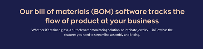
Source: inflowinventory.com
By sending traffic to this landing page when targeting BOM-related keywords, InFlow ensures that the people interested in the topic land on a page that's perfectly optimized to answer their concerns and questions. By doing this, the brand is exponentially boosting the chances of those web visitors becoming paying customers.
2. Not fixing technical issues
Another landing page mistake to avoid is allowing technical issues to hurt your conversion rates and brand reputation.
Research shows that web users have very little patience for pages with slow load times. Furthermore, they likely won't put up with poor optimization for mobile traffic (which accounts for 54.8% of all website traffic globally). Finally, layout design that doesn't consider eye-tracking data to make pages more user-friendly is much more likely to result in bounces.
Fortunately, you can easily address these technical issues with a few optimization fixes.
Page speed
For slow load times, consider removing any plugins, add-ons, and excess instances of code that hog resources. Furthermore, enable caching on your site to allow return visitors to get faster load times. And, of course, don’t forget to optimize the size of your images. Even something as simple as changing the file format can reduce load times, getting you to that 0-4 second sweet spot.
If you’re not entirely sure how your landing pages rank in terms of page load times, a great (free) tool you can use is Google’s PageSpeed Insights. Not only will it provide you with info on how your pages perform, it will also give you great suggestions for making your pages load faster.
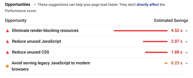
Source: developers.google.com
Optimize for mobile traffic
Once you’ve minimized page load times, you’re already on your way to having made your landing pages mobile-friendly. But, to truly ensure a great user experience for mobile devices, it’s a good idea to take a few extra steps.
The best way to optimize your landing page for smartphones and tablets is to approach the design process knowing that you’re working with limited screen real estate. With smaller screens, you have to ensure that you don’t have too much going on - both in terms of copy and visuals.
For example, if you compare the desktop and mobile versions of Scott’s Cheap Flights website, you’ll see how well the design works on a smaller screen. There’s not too much text, the CTA buttons stand out despite the small dimensions, and the layout favors the value proposition and not the accompanying visuals.
Desktop version:
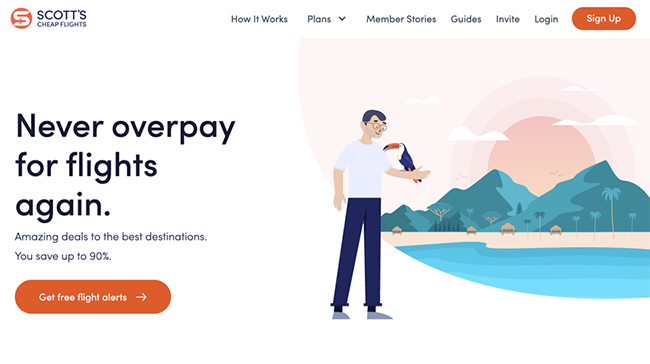
Source: scottscheapflights.com
Mobile version:

Layout design
Finally, to make your landing pages fully optimized to capture and hold on to web visitor attention, you will have to design the layout in a way that corresponds to people’s online behavior.
Research from the Nielsen Norman Group regarding text scanning patterns shows that people usually consume website content in one of four ways:
- F-shape pattern
- Spotted pattern
- Layer-cake pattern
- Commitment pattern
So, to ensure that your most valuable messages get across, you can purposefully direct user attention with headings, images, and bullet points that follow one of these patterns.
For a great example of how to do this, check out this landing page by Brandfolder.
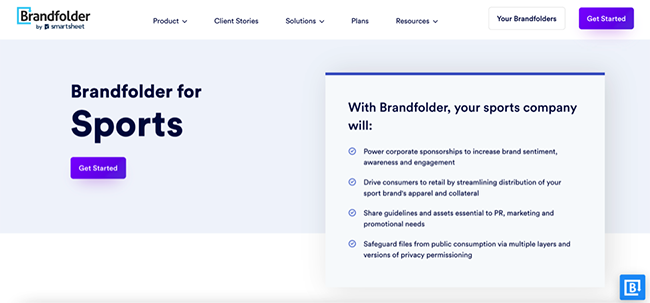
Source: brandfolder.com
As you can see, the layout clearly draws attention to the word “sports” on the left side of the page. Then, user attention is directed towards the bullet points, each describing a feature of the SaaS product. Finally, web visitors can scroll down to get an in-depth explanation of each of the features. Here, the design team chose to use typography to draw attention to the key points and the copywriters kept the text concise and organized around short paragraphs to allow for scanning.
The end result? A landing page optimized for scanning instead of reading, which has a much higher chance of capturing leads than a solid block of text.
3. Unfocused design
Another impactful way to make your landing pages more effective is to audit your design choices and identify opportunities to improve performance. Because distractions, clutter, and repetition compete for web visitor attention, one of the best things you can do to boost landing page effectiveness is to re-examine each element you use.
Visuals
Research shows that users start to form impressions as soon as 0.05 seconds after landing on a webpage. And, it turns out that visuals have one of the most significant impacts on user experience.
With this in mind, the images, videos, and graphics you use on your landing pages have to do two things:
- Elicit a positive reaction from your website visitors
- Successfully summarize and support your unique value proposition
As an example of a landing page that does both, check out the Calendar Analytics and Insights landing page from TimeTackle. Knowing that its sole purpose is to prove how it can provide customers with actionable data, the design team behind this page decided to use a combination of in-app screenshots to illustrate the value provided by the app.
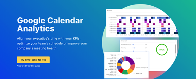
Source: timetackle.com
CTA buttons
Having users land on your website is not enough to secure the success of your business. That is, in addition to attracting people to consider your offer, you have to successfully encourage them to take action.
The best way to do this is with well-designed CTA buttons.
One common mistake brands make on their landing pages is to allow their calls to action to become unfocused. They want to say too much, too soon. And the end result is a confused customer who doesn't convert.
To avoid this mistake, limit the number of actions you invite your web visitors to take. Ideally, use one CTA, then strategically position it in places where people are bound to see it.
Look at how Flamingo does it. This brand uses the same CTA button at the top right corner of their page and in the hero section. It’s also at the bottom of the landing page. The result is a uniform look combined with a clear direction that potential customers can take as they move down the sales funnel.
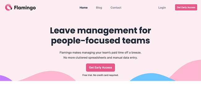
Source: helloflamingo.com
Many small factors can influence the success of your CTA button, such as shape, colour, position. Use A/B testing to verify what works best with your audience.
Negative space
Finally, if you're looking at ways to avoid cluttered landing pages, consider whether your mission could be accomplished by adopting a more minimalistic design approach.
In design, using negative space around high-value page elements can draw user attention to these details with the help of contrast. Because the web visitor isn't bombarded with excessive design elements, they can fully concentrate on the content they're consuming, maximizing the chance of the brand's message coming across effectively.
To see the use of negative space in action on a landing page, go no further than AMZ Pathfinder. Despite selling a complex range of services, the brand does a stellar job of holding user attention, mainly due to of a simple design that combines negative space, graphics, and simple language.
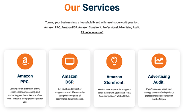
Source: amzpathfinder.com
4. Ignoring microcopy and trust signals
Another common landing page strategy mistake to avoid is starting off with the preconceived notion that your target audience trusts you.
The truth is, in 2021, consumer trust is the most precious asset your business can have. According to the Edelman Trust Barometer, trust impacts as much as 53% of purchasing decisions (second only to price at 64%). Moreover, it has an exponential influence on customer loyalty (75%), engagement (60%), and advocacy (78%).
From this data, it's clear that successful landing pages must do everything in their power to drive trust.
Social proof
The most obvious way of driving trust on brand websites is to implement social proof. You can do this by displaying testimonials or, better yet, by showing real-life data collected from customers.
Olark does this spectacularly with a homepage section dedicated to case studies. It shows that Olark is the software of choice for big brands, detailing the results its clients achieved using using its software solution.
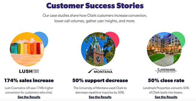
Source: olark.com
Microcopy
Another great way to drive trust on your landing pages is to think about all the instances where UX text might prove to your audience that opting for your brand is a risk-free decision.
For example, Aura does this with a "free" badge to its CTA button.
Source: goaura.com
Amazon’s approach is to give precise information about the price of its Prime service, also adding the detail that the subscription can be canceled at any time.
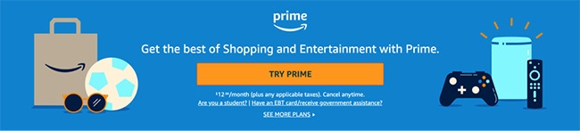
Source: amazon.com
Trust badges
Finally, if you want to help people see that your business is an authentic choice for their needs and that they can safely trust you to deliver on your promises, it's a good idea to consider adding trust badges to your landing pages.
You can list secure payment methods you accept; give information on your shipping and returns policies; mention any satisfaction guarantee you have in place; outline your ethical policies. Blue Heron Botanicals does this beautifully, with custom trust badges demonstrating their eco-credentials that are both visually pleasing and informative.
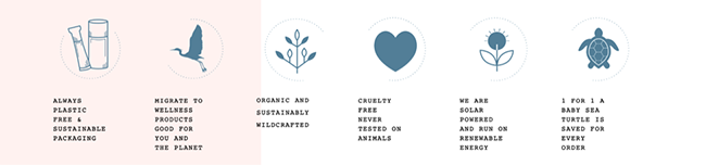
Source: blueheronbotanicals.com
5. Skipping the testing phase
Last but not least, the biggest mistake you can make in your landing page strategy is to skip the testing phase.
Yes, it's understandable that you want to get your asset published and bring in customers as soon as possible. But the truth is, each business has a unique audience, which means that every design and UX decision needs to be molded to fit that audience's preferences.
Fortunately, testing landing page performance is getting easier by the day, thanks to advanced testing tools available on the market. Spend time on testing to really investigate whether there are any improvements you can make. In the end, if a slight change in layout, copy, or color scheme can raise your conversions, then it's time well-spent.
In closing
As you can see, many things can go wrong when designing landing pages for your business. But fortunately, there are plenty of strategies you can implement to avoid the most common landing page mistakes.
By being aware of the five oversights we've listed and taking the right steps to avoid or fix them, you can set your landing page up for success. And, best of all, you can always do better, as long as you keep measuring performance to identify areas for improvement and make data-based decisions to get the most out of your website.