Contents
If you've already got your analytics set up you might want to check out my article on monitoring your SEO performance with Google Analytics. If not you can use the links below to hop to a specific part of the article or read through the whole guide for an entire walkthrough of the process from start to finish.
How analytics work
- Server-side analytics
- Page side analytics
Setting up your account
Installing Google Analytics
- If you use a CMS
- Through your hosting
- Manual set up
Using Google Analytics for SEO
How analytics work
Knowledge is power as they say. So before you dive into getting your analytics set up you may want to take a moment to understand a bit about how analytics works. If you already know, or just want to get started right away then jump straight to Setting up your account.
Server-side analytics
There are typically two types of analytics, these are server-side and page-side analytics. Server-side analytics are becoming increasingly rare as these tend to be more cumbersome and less accurate. These work by keeping track of every asset which is requested from the server. This can then be used to calculate how often a page is loaded and therefore from that, traffic to the website.
Google analytics is page side and has two distinct parts. Google 360 is the enterprise solution, which is meant for large businesses and is expensive. In fact, many organisations of considerable size and revenue still use the free solution, Google Analytics, as it’s so good you don’t really need to change.
Page-side analytics
Page-side analytics, like GA, instead rely on a small piece of tracking code on each page of the site. That’s really what’s at the heart of any analytics - what is being looked at, who’s looking at it and when they are looking at it. So the tag itself doesn’t need to do anything that clever, it’s the analytics package that puts all that data together and provides all the really useful insight from it.
Server-side analytics often report higher numbers than page-side, but the latter is more accurate. So if you have two sets of analytics with conflicting data, believe the page-side ones. Neither is infallible and you’ll find that GA actually use sampling and estimated data for sites with very high usage. These are the sorts of sites which may find the Analytics 360 package useful.
One other thing to mention is that Google does not use the data from GA in any way to influence rankings. There is no ranking data taken from analytics at all. So don’t think that you’re giving yourself an advantage or disadvantage in this way by using them. It’s just not true. There are plenty of instances of Googlers saying it doesn’t, and also, it just wouldn’t make sense. Google can get the data it needs without needing to use a metric that can be so easily manipulated or just… turned off.
Setting up your account
So now you know how it works in theory, let’s have a look in practice. The first step is signing up for a Google Analytics account. You’ll find the sign-up process pretty straightforward, especially if you already have a Google account. So first of all you log in with your Google Account (just register one if you don’t have one already) and you’ll be shown this page neatly explaining all the steps to getting up and running:
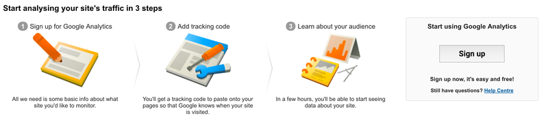
Once you hit sign up you’ll be asked for some basic information about your website (like the URL) which is used then used to generate your tracking ID. Hit the button again, you’ll be shown the T&C’s and then redirected to the tracking code page. Now comes the very slightly more tricky bit, which is actually connecting your website to your Google Analytics account. Don’t be put off at this point though, it’s probably much easier than you might think.
Installing Google Analytics
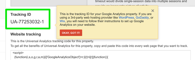
However you install GA you’re going to need your Tracking ID. This is the unique identifier that tells GA the data belongs to your account. When you first create your account you’re taken to a slightly complex looking page with lots of options. Whichever one you use you will likely need the tracking ID which looks like this:
To make it easy we’ve broken down the main options for you. Just click on the link below to be taken to the relevant section in this article, or skim through them all to decide which is the right solution for you.
If you use a Content Management System (eg. Wordpress)
First off, if you use one of the following platforms it’s even easier, as they have created plugins or modules you can use to install GA without the hassle. Here are the relevant guides:
Through your hosting
If you’re not using a CMS with its own GA module then there is a second option. Most hosting services these days also offer their own ‘built in’ GA solutions. Listed below are the guides for the most popular services. Check with your hosting support sction if yours isn't included below.
GoDaddy
Google Sites
Adobe Commerce (previously Magento)
You can find a more extensive list on Google’s own page on the subject:
https://support.google.com/analytics/answer/1008080?hl=en
Manual installation
This is the catch-all ‘traditional’ solution. It can be an effective solution for static sites with fewer pages, but you’ll want to use a dynamic solution (one that updates automatically) if your site is bigger or updated more often.
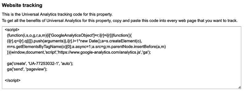
All you actually need to do to get GA up and running is install a couple of tracking tags. These are JavaScript snippets which notify GA when a page is loaded and pass on information about who is viewing it.
If you’re going to go down the route of manually installing tags we advise you to look at Google Tag Manager. This is especially useful if you have to pay a developer to add the tags to your site. It means you can just get the tag manager code added and then update your tag manager account to install new tags or edit existing ones rather than worry about paying a developer each time.
The code you need can be grabbed from your account where it will be shown when you log in until the account is verified. It should look something like this:
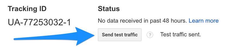
Whatever method you choose to get your tracking tags set up you can test your setup by sending some test traffic to your site. Within your GA account on the tracking code page there is a button just for this:
Setting up Goals
Setting up the eccomerce side of GA can be a lot more complex but it also very powerful. If your site sells a limited number of types of products there's an easy way round this with Goals. These can be set up by going to the Admin tab and navigating to the Goals section:
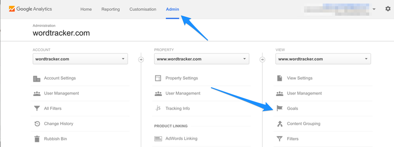
Here you can select the New Goal button and fill out the form. The best type to begin with may be to use a Destination Goal. Name the goal and on the next form add the URL of a thank you page or other page which appears after the completed check-out process. You can also assign a monetary value, to give the amount which is generated when that goal has been reached.
This is a great way of easily adding eccomerce tracking into GA and allowing you to start using your analytics in a much more powerful way.
Using Google Analytics for SEO
Check out the next article How to set up your Google Analytics where we cover how to get started using GA for your SEO campaigns.