How do you persuade someone to visit your web page? And how do you persuade them to purchase your product or sign up for your newsletter? Landing page optimization is the answer. We have some handy tips to follow and some examples of websites who already know the secrets.
Edit: This article was originally posted early 2012. Now, looking back at the same websites in 2015 we can see some massive changes in the layout, design and sales techniques used. We've updated the examples with screenshots from January 2015 so you can see the latest design trends in action.
What's the difference between a landing page and a home page?
A home page provides information about your site. It will likely have lots of links to other pages within your site and it's useful for the visitor who is just browsing.
The landing page is more specific. What it aims to do is convert a visitor into someone who purchases a product or service, or signs up for a newsletter. Whatever the specific goal is you want that page to achieve. It will be the page that you use to convince your prospective customer that they should purchase from you or sign up with you.
In the words of "America's Greatest Marketer" Seth Godin (according to American Way Magazine) a landing page is there to initiate only one of five actions:
- Get a visitor to click (to go to another page, on your site or someone else's).
- Get a visitor to buy.
- Get a visitor to give permission for you to follow up (by email, phone, etc.). This includes registration of course.
- Get a visitor to tell a friend (about your site or product).
- (And the more subtle) Get a visitor to learn something, which could even include posting a comment or giving you some sort of feedback.
What benefits will you gain from an optimized landing page?

1) Like a needle, you'll get found more easily in the haystack that is the internet.
2) More people will convert when they arrive at your website (ie, take the course of action that you intended them to take).
3) You'll maximize the return on the investment (ROI) you've made on your campaign.
4) You'll learn about your customers' likes and dislikes.
What makes a good landing page?
One that enhances the user experience. This will benefit you because even if the visitor doesn't carry out the action you'd like them to, they'll still associate your site with a good experience. This will help them remember you, thereby increasing brand awareness and making it more likely they'll come them back in the future.
Your page should focus on one or two things - no more. For those who don't take you up on your fantastic offer, think about having a secondary offer for them in order to keep them interested in you. A free e-book, perhaps. You could link to it from a text link underneath the main CTA (call to action - more below) button. Look at what CoffeeCup have done:
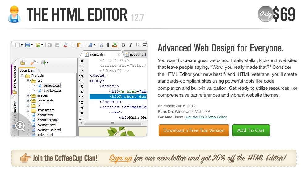
The green button is the one that stands out the most - a simple 'Add To Cart' CTA. And they also have the option of a free trial to keep non-purchasers interested.
Their stroke of genius, however, is the cleverly designed linked image below those buttons. If you sign up using that button, you'll get 25% off, and CoffeeCup will have another customer on their mailing list.
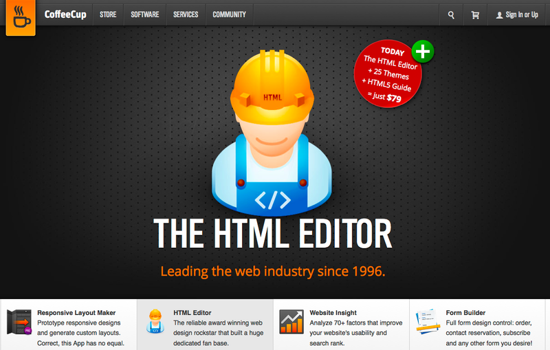
Update: CoffeeCup have simplified their design significantly replacing the picture of html code with a little building character and a bold offering on the top right.
Don't have navigation links on your page if you can help it, so as not to encourage your visitor to click to another page.
Your landing page needs to be targeted. For example, traffic from an email campaign promoting an e-book will need to arrive at a page selling that e-book.
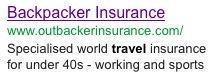
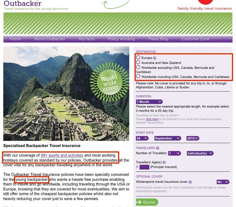
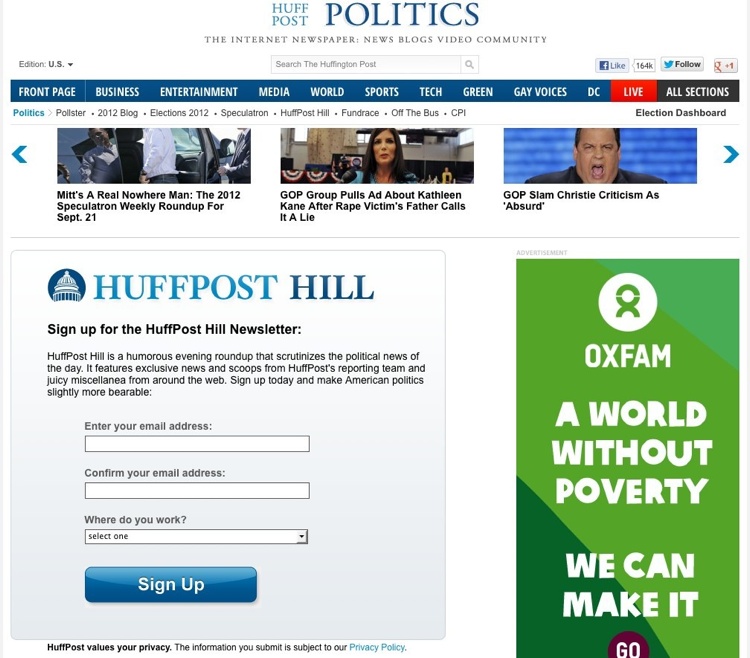
The content on the page should be entirely relevant to what the campaign was talking about. Here's an example - a paid ad for outbackerinsurance.com from 2012:
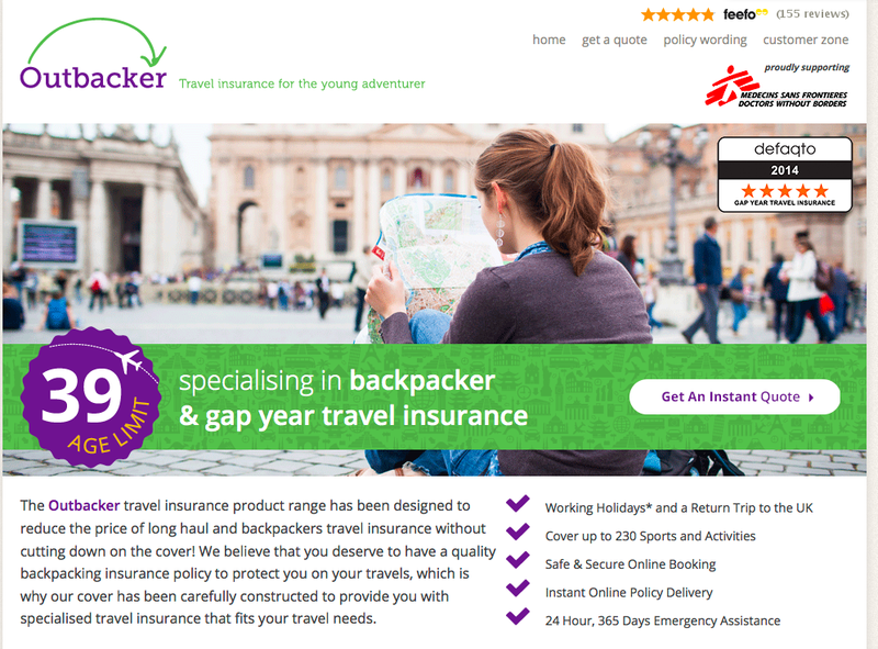
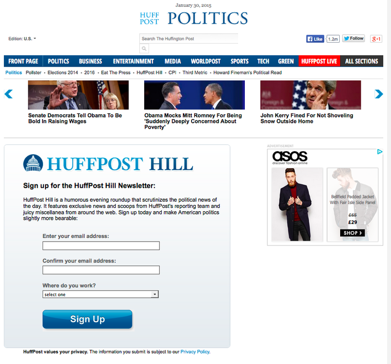
And here is the latest ad from 2015:
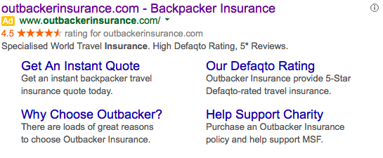
This page should point to one offering world travel insurance geared towards under 40-year-olds. It should also offer insurance for both work trips and sports holidays. And it does all that!
Update: In 2015 the hero image now spans the whole page and the big purple badge specifies the target age group.
Less is more - don't clutter your page. This isn't the case in the picture above, as insurance companies need a certain number of details before they can quote. That form has far fewer fields than many online insurance forms I've seen, though!
Here's an example of a clean, uncluttered page by the masters of the clean, uncluttered page:
Update: New landing page as of 2015 - still looking clean and uncluttered!
Your headline
Have a clear headline that tells it exactly how it is and spells out the benefits for the viewer. The one below offers lots and lots of lovely free music, only a click away:
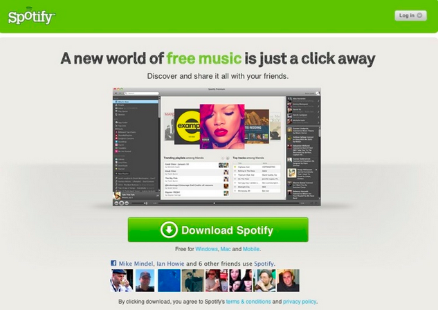
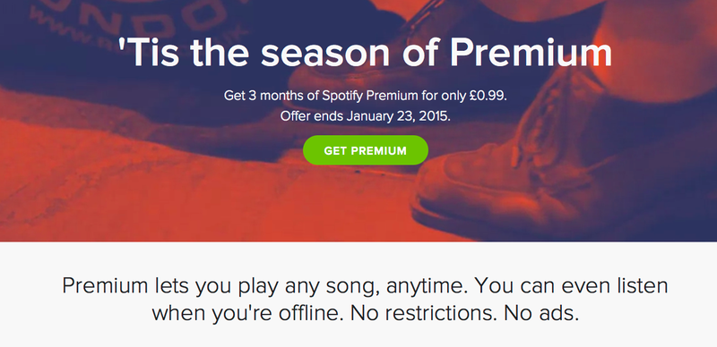
Update: Spotify still use the headline but their design is simpler and flatter, very on trend for 2015!
Or have a teaser headline. Like this one for an expensive luxury car:
"No, We Don't Offer Mortgages"
The headline, as well as the description, has to be consistent with your ad copy or email campaign. Otherwise visitors will press that back button, simple as. And a consistent message will increase response.
Don't be bland. Refer to something in the copy on the page, so that the reader just has to carry on reading.
The headline should be eye-catching both in what it says and how it looks.
The copy on your landing page
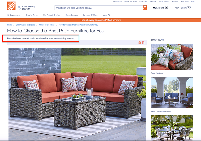
The first paragraph or two (the standfirst or lead) is the second chance in your landing page copy to grab your readers' attention (after the headline). Magazine feature writer John McPhee said that a good lead is like a flashlight shining down into the story. And that's exactly how you should think about it: use it as a chance to get your visitors to read on. Here's an example from Home Depot:
The aim of everything on your landing page is to get your visitor to take an action. So, your text has to tell your potential customer that the action will be of value to them.
The design of the page and the copy describing how informative your e-book is/the benefits gained from signing up for your newsletter/how much time your widget will save, should aim to do just that.
Use Johnson Boxes on your sales page to highlight important information. They normally stand apart from your main copy, often in a different font to attract attention, and usually at the top of the page. Here's an example of a modern take on a traditional sales technique:
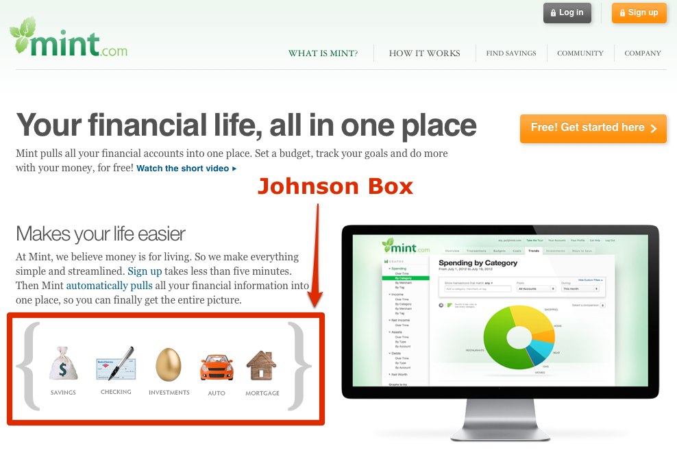
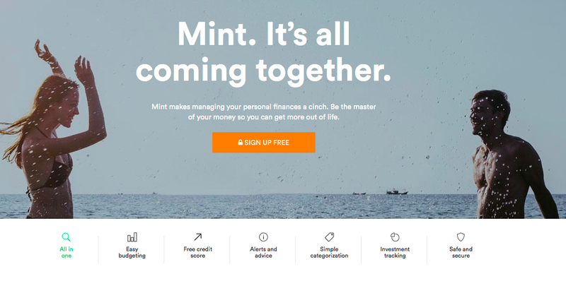
Update: Like many websites mint.com have incorporated a full width hero image with simple, minimal icons to highlight the values of the product or service.
Call to action
Your CTA is the strong and irresistible text that urges your viewer on to carry out your required action. And the way it's presented - on a big, colorful button or in a big, colorful text link or image - is very important.
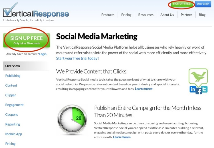
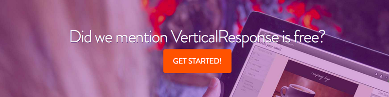
The aim is to have something that catches the eye and makes clear what happens next. And if you have more than one thing going on on your page, that CTA should stand out. This Vertical Response page includes a login button as well as the site's navigation buttons, but it's the "Sign Up Free" buttons that stand out:
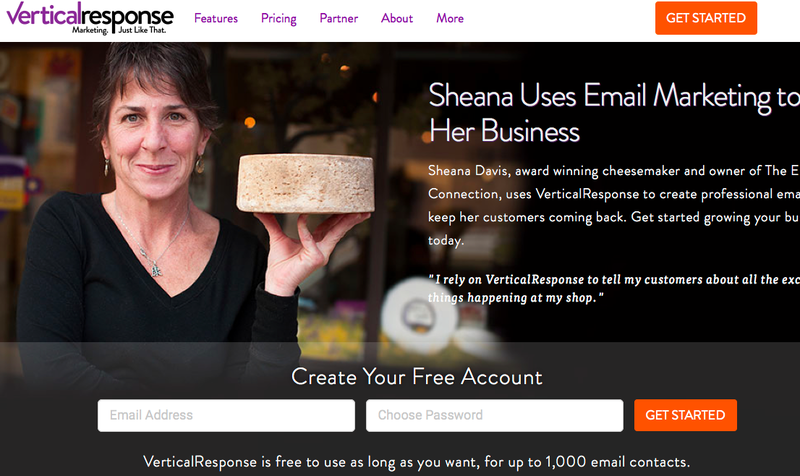
Update: Flat button design, hero image and strong call to action - there is a pattern emerging here!
"Free" of course helps, and the green color is eye-catching because it's more of a contrast than the subtle blue. And "Only takes 30 seconds" is a very attractive encouragement to your potential customer. Make sure this promise is real, however, or it will only cause you harm and a visitor who will never come back.
Further down the page, there's another enticement - a free trial with no credit card details required. Perhaps the "no credit card" could've been placed further up the page? This is definitely worth testing.
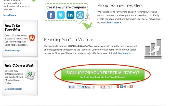
Update: The button is now a flat design laid over an inspiration image with a strong trigger and clear call to action.
If you have a long page, make sure you have at least one CTA below the fold.
Don't clutter your page. We've all seen pages where there's so much going on it's difficult to see any one thing on it. Have a bit of space around your CTA so that no-one is going to miss it. If this isn't possible have it in a very bright color.
Which are the best verbs to use in your CTA?
- Order
- Buy
- Purchase
- Shop
- Find
- Compare
- Download
- Join
These are just some examples.
It's impossible to say which is going to work best for you, but your best CTA is the one that that gives you the best conversion rate (not clickthrough rate). So testing is the only way to figure that out (read about testing further down the page).
Do however use a verb and have it as the first word on your CTA button - this encourages the visitor to take action. (By the way, this also works well in tweets according to Hubspot)
There's only one thing that's certain - not having a CTA is a mistake!
Build trust
Why do you need to build trust?
The internet's been around for a while now and people are becoming more savvy about identifying dubious websites. Having indications on your site that you're a company to be trusted will help put their minds at rest and make people more likely to buy from you. Following are some examples of what to include that will help engender trust.
Security
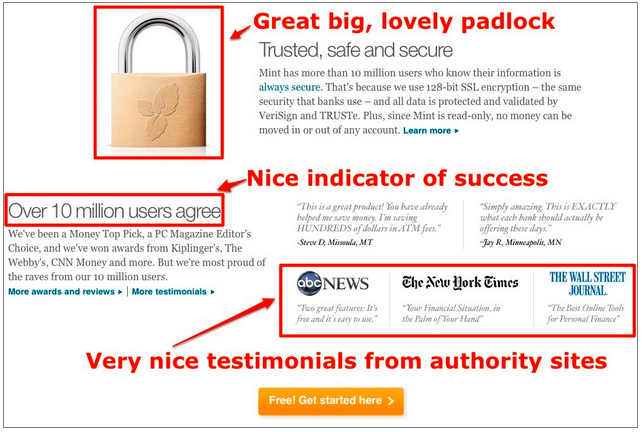
Mint on their What is Mint page use a great big lovely padlock as well as a statement that describes how quickly and securely you can sign up:
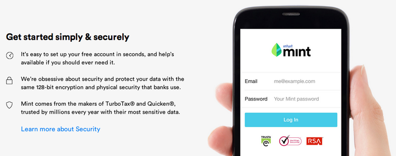
Update: Mint's 2015 security information is much cleaner with simple icons.
There's also a link to another full page on the security credentials (all this appears below the fold).
Don't act like the type of get rich quick guru outlined in this post on ZDNet making claims you can't substantiate. People are becoming more able to see through exaggerations and lies (not that any of Wordtracker's readers stoop to such a thing).
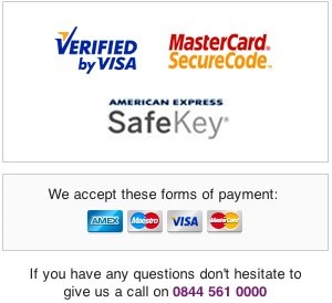
Include logos to quieten any doubts your potential customer might have as to how secure their credit card details are going to be. These are from the PC World shopping site in the UK:
Success
An indicator of success helps to promotes trust: hell, if 10,000,000 users have already signed up (see the picture above), why wouldn't you?
Endorsements.
On the Mint page are references from authoritative sites in the form of logos from ABC News, NYT and The Wall Street Journal. That can only help.
Use real testimonials: try testing with and without photographs, with long or short quotes, lots of them or just a few.
FreeAgent Buzz shows lots of recommendations, some above the fold ...
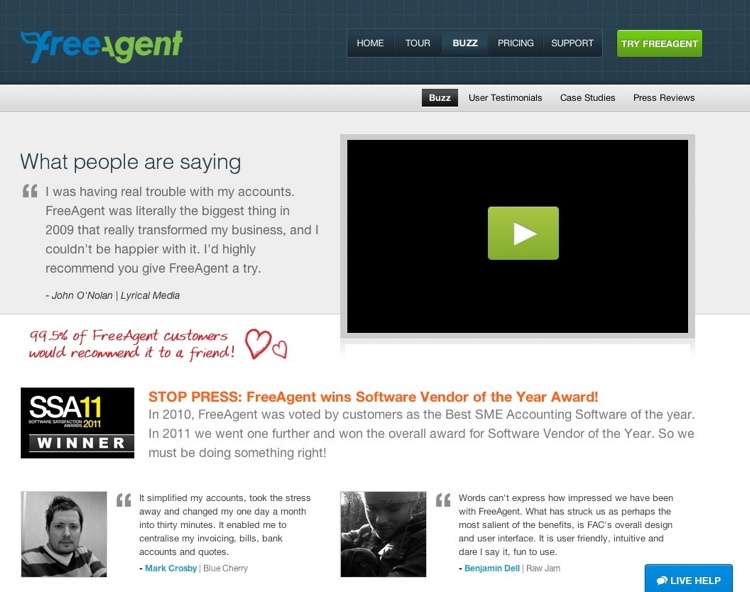
... and some below ...
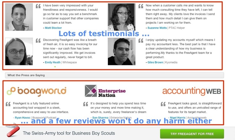
Update: FreeAgent has developed an cartoon aesthetic, 2015.
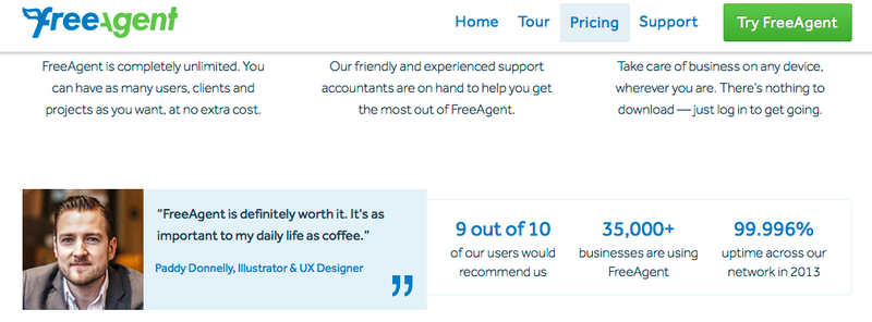
Update: With 1 testimonial on the pricing page backed up by some stats
Awards
And FreeAgent, as you can see in that first picture, shows that they've won an award. Don't hide your light under a bushel.
Contactability
Include a phone number or have a live chat pop-up - it'll let the user see that you're a real, contactable company.
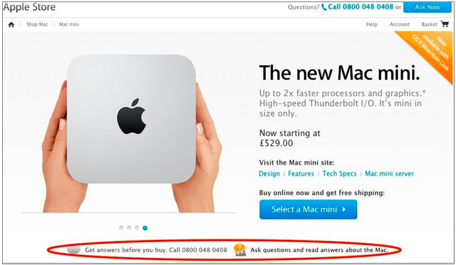
Update: In 2015 Apple are still displaying the contact phone number and live chat link.
Consistency in design
If your page is situated on a micro-site, away from your main site, use the same logo and branding as that on your main site so that your visitor doesn't have to wonder if you're a fake or not.
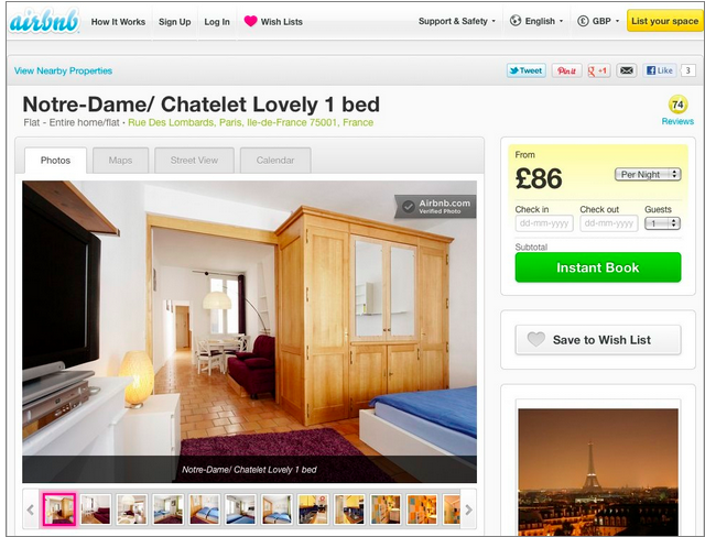
A hero image
A good, big, lovely graphic is a nice thing to have but don't feel you have to use the latest fancy, schmancy all-singing all-dancing graphics to illustrate your point. That will just distract your visitor. Think simple, like this from Airbnb :
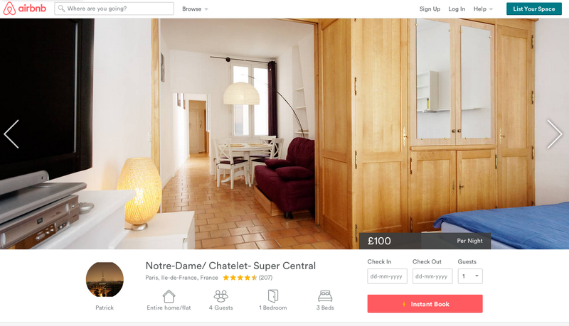
Update: Airbnb caused quite a stir on social media with their logo and website update in 2014.
The big picture of this attractive, bright, one-bed room in Paris is a great incentive to book and the big "Instant Book" tells you that you'll not have to go through the annoyance of waiting for the owner to get back to you. You can just fill in a date, and book.
Forms
Ask only for the information that you really need - the less your visitor has to complete, the better.
Make the text easy to read and make the form attractive and simple. Don't make it look like something you're filling out for the tax man. Here's a good example:
Update: 2015, no change! Except for the news of course.
And note the reassuring Privacy Policy underneath.
Social buttons
There's a lot of advice out there to include social buttons on your landing page so that people have a chance to pass on the details of your magnificent offer. But it makes much more sense to have these on your confirmation page or email after the action has been completed. Have as little as possible to distract from the job in hand.
Test, test, test
Finally, testing is the only way to find out if you can improve your pages to increase your conversion rate. There are two main types of testing you can carry out:
A/B testing: This is when you submit two different variations of a web page to a percentage of your audience and see which one performs better. Perhaps you have two different designs in mind for your page. Create two versions of the same page and wait to see how the clickthrough numbers differ. There's a good guide to A/B testing on Smashing Magazine And you can do this free using Google's Content Experiments that you'll find within Google Analytics.
A/B testing is one that smaller businesses with growing levels of traffic should be doing. Multivariate testing (below) is only really viable for sites gaining a lot of traffic when the results presented will be significant enough to mean something.
Multivariate testing: Testing more than one element within a web page. Elements to test could include the button color, CTA, button size, headline text, description, image and image size or page layout. At the moment, Content Experiments doesn't support this feature even though their previous tool, Google Website Optimizer, did. However, they're supposed to be reintroducing multivariate testing. In the meantime, there are many paid tools out there to help with this task.
Get a free 7-day trial to Wordtracker's Keywords tool
A subscription to Wordtracker's premium Keywords tool will help you to:
- Generate thousands of relevant keywords to improve your organic and PPC search campaigns.
- Optimize your website content by using the most popular keywords for your product and services.
- Research online markets, find niche opportunities and exploit them before your competitors.
Take a free 7-day trial of Wordtracker’s Keywords tool