When most people think of website design they are thinking about the aesthetics of the site. However, much more goes into designing a good website than just the way it looks. When designing a site, you need to consider how the user is going to use it. Think through the way they will navigate the site and what they are looking to find or do.
Approaching your design from the point of view of the customer will help you to create a site that is more user-friendly. Furthermore, optimizing your website’s design can help you to identify and troubleshoot issues and ultimately increase your conversion rates.
Your first step to designing a site that users will love is to understand user intent.
User intent
Every visitor to your site has a reason for being there. They have some need that they are trying to satisfy with the help of your website. This is called user intent – in other words, their purpose for being on your site.
So, why does user intent matter when it comes to website design? Understanding what information the user is looking for can help you to create a clearer path to that information. If a user is able to easily navigate through your website, they are more likely to return to the site or even make a purchase right then and there.
In order to make sure your site is designed in such a way that will meet the needs of your users, consider the three types of user intent:
- Informational users - These users are interested in finding out more information about the product/service you offer or your company as a whole. Finding information is the driving force that brings them to your site.
- Educational users - These users are looking for solutions to a problem that they have. Typically, they haven't decided on a specific solution at this point, but they are considering their options. They are looking for industry-specific topics rather than information about your company.
- Transactional users - These users are ready to make a purchase. They arrive at your site knowing exactly what it is they are looking for. You want to provide transactional users with an easy and straightforward purchase experience.
How to use user intent
Now that you know the types of user intent, you can more easily identify how each type of user is navigating through your site. The best way to accomplish this is by analyzing the data from the Users Flow Report in Google Analytics. This report serves as a “graphical representation of the paths users took through your site, from the source, through the various pages, and where along their paths they exited your site.”
As you start to analyze the report, it will become easier for you to see how to improve your website to give your user a better experience. Once you have pinpointed how users are moving through your site, you will begin to identify the issues that need to be corrected. One of the most common website design features that needs improvement is the navigation bar.
How to organize your navigation bar
Using your Users Flow Report, you will begin to find the established navigation patterns of your users. This information is key to designing a navigation bar that will benefit your visitors. Your navigation bar is to your website what the table of contents is to a book. It helps your user to easily find what they are looking for.
The first step in setting up your navigation bar is to create a content hierarchy – essentially, organizing your content into categories and subcategories. The purpose of these categories is to help the user find what they are looking for. Make sure that they are clearly defined and easy to understand.
Additionally, do not stray too far from the ordinary on this step. Users like consistency. They want to be able to easily find what they are looking for on your site. If your setup or wording differs too much from what users are familiar with on other sites, they will choose to look elsewhere.
Consider the following strategies when organizing your navigation menu.
User intent types
One way to set up your navigation bar is by user intent types. This helps to ensure that each set of users knows exactly where to go and can easily find what they’re looking for.
For example, informational users like the About Us page on your website. They want to learn more about you and what your company has to offer. A strong About Us page can help set you apart from your competition.
Educational users, on the other hand, are looking for industry-relevant information that is not about your company specifically. This can be accomplished through blog posts, eBooks, and how-to guides. Write about what is happening in your industry, answer frequently asked questions, or discuss other topics that users are interested in learning more about.
Finally, transactional users are on your site to do business. Provide them with a clear and easy path to finding your product pages and making a purchase. The easier it is for them, the higher your chance that they will convert.
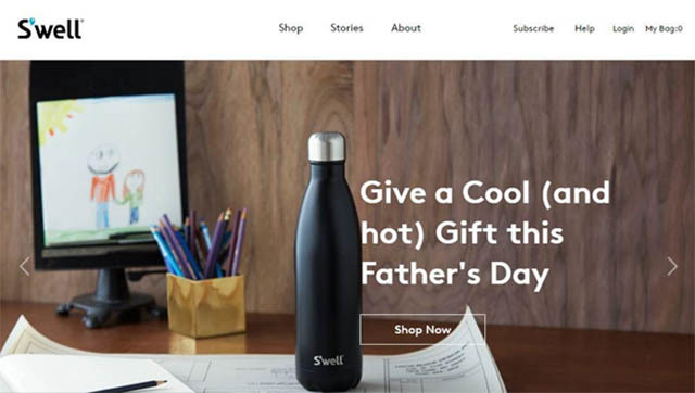
Let’s take a look at an example from S’well, a company selling reusable bottles. Their navigation bar consists of only three categories and each of these corresponds to a user intent type. Shop is for transactional users, Stories for educational users, and About for informational users. This type of nav bar organization makes it easier for visitors to know right away which category they should go to.
Product-centric
Using a product-centric approach is valuable when you have products and services that can easily be separated into groups. You can create navigational categories based on each overall product type.
This can be helpful to users as they are able to get a better understanding of the category as a whole before honing in on a specific product. Additionally, if they want to review similar products within a category, they are easily able to navigate between them.
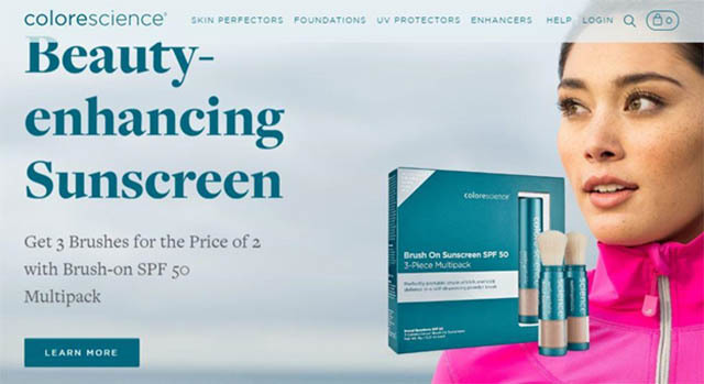
This next example comes from Colorescience, a makeup brand. By having four clearly defined categories, Colorescience is able to organize their products in a way that users can easily understand. Brands that have more categories or ones that don’t offer consumer goods may want to take a different approach.
Customer-centric
If your business has different target markets with varying needs, you can organize your navigation bar by customer type. Create sections for each specific group of customers – this will make it easy for them to find the information that applies to them specifically. Ultimately, you are saving your customer time by giving them one path to all the information they might be looking for.
It’s important to note that this tactic is not for everyone. If your business has a lot of overlap between groups, setting up your navigation bar like this can actually make it more difficult for your customers to find what they are looking for. Only employ this tactic if you have distinct target markets.
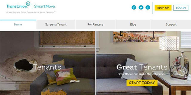
SmartMove, a division of TransUnion, organizes its navigation bar based on the two types of customers it serves – landlords (Screen a Tenant) and renters (For Renters). Since they provide different information to each group, SmartMove makes it easy for both customer types to quickly and easily find what they are looking for.
Navigational bar tips and tricks
Now that you have a better understanding of how you want to organize your navigational bar, here are some general tips to keep in mind. Remember, user intent should play an important role in your website’s design, so think about how these rules apply to your specific users.
Number of categories
While it is important to list all necessary categories in your navigation bar, there’s a fine line between giving a user options and overwhelming them. Try to narrow down your categories to include only the most important, most used, and most generic (without being too broad).
To make it easier for the user to navigate to the information required, try to limit your categories to less than seven. This can also help to make your site more user friendly across devices – specifically mobile.
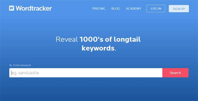
For this example, you could just scroll up to the top of the Wordtracker site, but for your convenience I’ve provided a screenshot below. Wordtracker uses just five categories in the navigation bar to help users locate the information they need, without providing too many options. The categories are broad enough to encompass all necessary subcategories but not too broad that they could be confusing.
Keep wording clear
The wording you choose for your categories should be clear and simple. Try to limit your wording for each category to 12 characters or less. You also should stick with phrases and terms that people are familiar with. Titles like About Us are quickly recognized by users because they are commonly used.
Also, remember to keep it short and sweet. Instead of using something like Industry News and Information, keep it to just News. Your user will still be able to identify what they will find in that category.
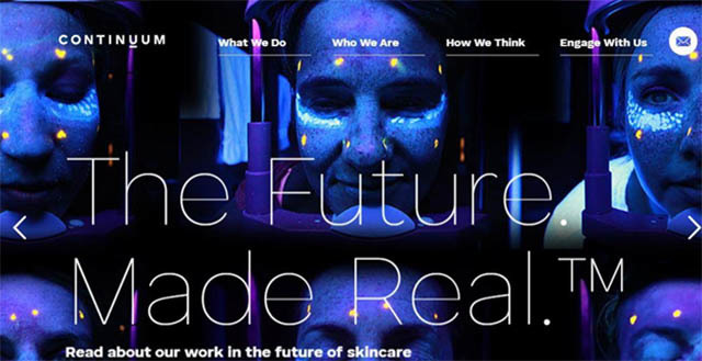
Continuum, a global design firm, uses more creative wording in their navigation bar. While it isn’t wrong to use Who We Are instead of About Us, it could potentially lead to a user taking a roundabout path to get to the information being sought. If you do want to try using nontraditional categories, make sure you first analyze the Users Flow Report to ensure that users understand your category names.
Actions on the right
We have been trained since childhood to work from left to right. Apply this thinking to your navigation bar. Users generally prefer informational items on the left (e.g. About Us) and action items on the right (e.g. My Cart). This allows a user to naturally progress through your site from learning more all the way to making a purchase.
One thing to keep in mind is that your homepage button should always be on the far left. Many users treat the homepage as a way to go back. Thus, as they navigate from left to right, the homepage button allows them to start fresh on a new left-to-right path.
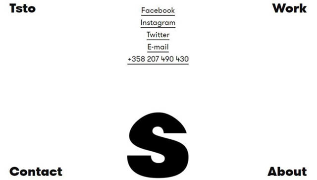
This last example comes from TSTO, graphic design agency. TSTO anchors their four main categories in each corner of the screen. This goes against our natural instinct to work from left to right and instead encourages the user to work in a circle around the screen. While a more creative navigation bar may make sense for an artistic agency, it will not work well in every industry so consider your users before taking this approach.
Closing thoughts
As you begin to assess your own website’s design, remember that every site and its users are different. It’s possible that not all of these rules apply to your site, so it’s certainly ok to bend the rules. As long as you consider user intent and how that plays into your site’s design, then you are likely going to create a great user experience for your customers.
Start optimizing today, and you’ll start to see an increase in your conversions.