The consequence of this change is that rather than showing the url of a web page in a search result, Google will now show the name of the website (rather than the domain) and a ‘breadcrumb trail’ rather than a full url.

At Wordtracker, we’ve always advocated a clear site structure that humans and robots alike can read easily, and now the reasoning behind that has even more weight - easy matching of urls to search results is going to help searchers better understand what they’re going to see when they click through to a page shown in the results. Here’s what Google say:
Well-structured URLs offer users a quick hint about the page topic and how the page fits within the website. To help mobile searchers understand your website better when we show it in the mobile search results, today we’re updating the algorithms that display URLs in the search results to better reflect the names of websites, using the real-world name of the site instead of the domain name, and the URL structure of the sites in a breadcrumbs-like format.
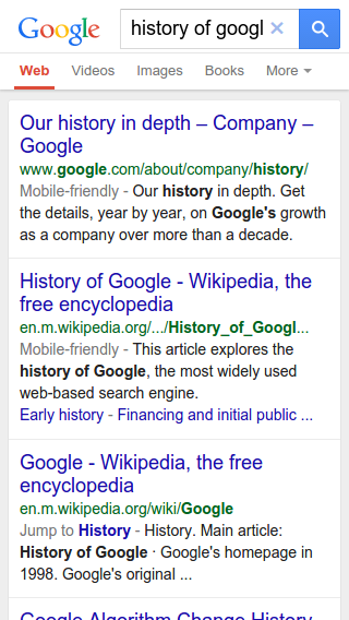
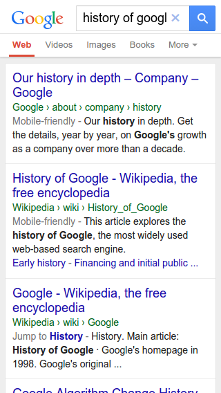
...and let’s have a look at their example for this:
before... |
after... |
 |
 |
In the US (but not worldwide… yet…), the name of the site is changed as well - you’ll notice from the first screenshots from Google, the difference between ‘en.wikipedia.org’ on the left and ‘Wikipedia’ on the right. We’d expect the change in the way the site name is displayed to be rolled out worldwide in the same way that the breadcrumb is shown right now, but that may take a little longer.
The new layout is definitely cleaner and easier to read. It piqued my interest, so I tried a search of my own to see how it compares with my desktop result. Here’s the mobile search, next to its desktop equivalent:

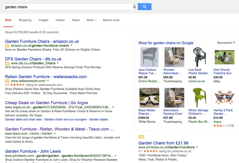
The results themselves don’t differ very much, other than the obvious format differences for shopping and PPC results, but look at the top organic result in each.
Mobile:
argos.co.uk > static > Browse > 2|ca… (it’s still long, so it’s truncated)
Desktop:
www.argos.co.uk/...garden%7C33005908/.../2%7Ccat_33005908%7CG…(again, truncated)
These two results point to the same page, but are displayed very differently in the search results. You’ll notice as well that there’s far less information in the mobile version, which is clearly intended to lessen the amount of effort a searcher has to make to decide whether to click through to that page or not, but we can see that the Argos breadcrumb isn't necessarily that helpful in the result set, so it still might take some refinement on site owners' parts to get perfect. Homebase's result is a bit better, with the breadcrumb category being shown as 'outdoor-living' which is a bit more relevant.
You could, of course, take the view that the fact that there's less information on view hinders your decision on whether to click, but you'd be in disagreement with Google about that (and I'm not taking sides just yet...!)
How do you best prepare for this?
To properly show the urls in this particular way, Google has introduced support for schema.org structured data (also sometimes known as ‘rich snippets’ or ‘microdata’) around website names and breadcrumbs. You can find clearly laid out information about how to implement this for your site name and breadcrumb on the Google developers’ site (it’s pretty straightforward if you understand html and have done a bit of reading about how schema.org works). If you want to properly control how Google shows your breadcrumb trail (and avoid the Argos example) then it's worth investing some time on this, as a change like this may become more relevant to how you rank in the future.
As we've seen with our examples, Google’s not bad at laying out a breadcrumb in the mobile SERPs even when this information is missing but like we see, not perfect), and it’s not beyond the bounds of possibility that at some point in the future, sites which have this in place may start to rank ever so slightly better than sites which don’t. Generally speaking, the less work search robots have to do to figure out how worthy of a high rank your site is, the better.
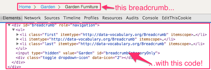
You may have noticed that in the screenshot of the desktop SERP, the tesco.com result already has the breadcrumb in place:
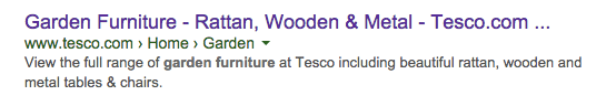
That’s because Tesco have already included that microdata in their pages:
There has been an awful lot of noise about Google’s ‘mobilegeddon’ update scheduled for the 21st April, which basically is a change to the algorithm which means that if your web page isn’t mobile friendly, it won’t be included in the SERPs. It is going to affect a number of sites (to be clear, this is a page-level update, which means that if some of your pages aren’t mobile-friendly, your whole site won’t be bombed out). This update shows that alongside all that noise, there are also more subtle elements at play, which, while they’re more about display than ranking, may have an effect on click through rates now, and (potentially) rankings in the future.
Are you ready?