Your home page is one of the most visited pages on your website. Few people will visit your site without seeing it. But a lot of home pages suck. Read this, and make sure yours doesn’t.
The Golden Rules
Building a great home page isn’t difficult. Not at all. It’s just that site owners and webmasters get so close to their websites that they forget the basics of conversion. If that’s you, or someone you work for, here’s a reminder of what, and what not, to do.
1) Show whatever it is you’re selling
This sounds obvious but you would be amazed how often sites don’t show off their products. The first thing users should see is whatever you’re selling. It should be big, bold and beautiful. I’m going to walk you through some examples now.
MailChimp.com is my absolute favorite website:
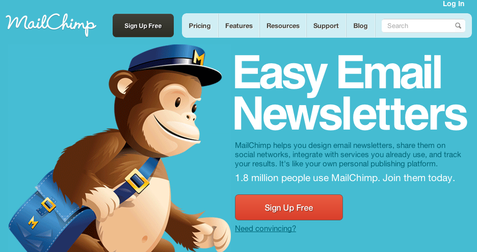
What do you suppose these guys sell? That’s right! Easy email newsletters!
If, like MailChimp, you sell a service rather than a physical product, try to encapsulate what you do in the simplest, shortest way you can. So if you’re a lawyer, you could say ‘No-nonsense legal advice’, an accountant ‘Tax returns the easy way!’
Keep it short, punchy and use real language. And try to include (where appropriate) words like ‘easy’, ‘simple’, ‘discover’, ‘free’ as these are the words that people tend to respond to. Visitors then know what they’re getting and if they’re interested, they’ll stick around.
But many of you are, I suspect, retailers. You sell stuff. So what should you do? Let’s look at Asos.com:
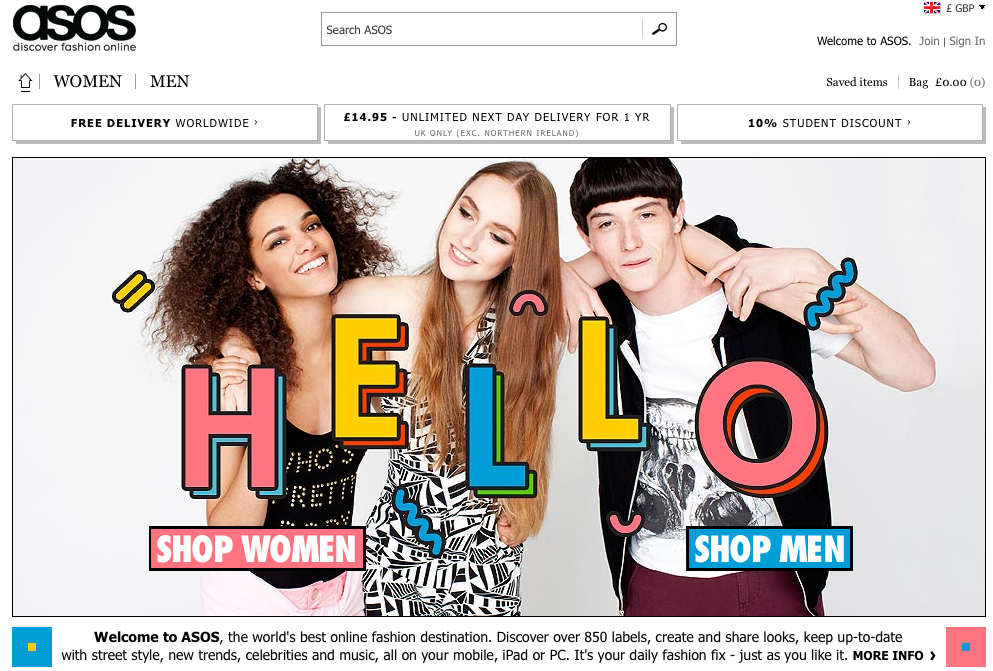
Even if you’ve never heard of these guys, you can tell instantly what they sell. Why? Because you can see the models looking pretty, the tagline ‘discover fashion online’, a little sales copy below the image and two big buttons ‘SHOP MEN’ and ‘SHOP WOMEN’. Everything makes the purpose of Asos super-clear. An alien landing on earth tomorrow could visit Asos.com and see, within three seconds, what the website is all about. Assuming of course, that alien civilizations understand the concept of clothing. OK that was a bad metaphor.
But what I love about MailChimp and ASOS is they use really eye-catching images. The Asos one draws in your eyes so you can’t help but look at ‘SHOP MEN’ and ‘SHOP WOMEN’. The ‘blue for boys and pink for girls’ color scheme might look like sexist nonsense, but it serves a purpose. I’ve been socialized to associate blue with boys, so before I’ve read the words, I know instantly that the blue button is what I, as a boy, should click. It’s genius in its simplicity.
MailChimp is again the one to watch. What’s the first thing you see? (I’ll give you a clue, it’s the monkey.) And where is the monkey looking? What is the arm pointing at? EVERYTHING sends your eyes to the sales copy and the ‘Sign Up Free’ button. Amazing.
Getting great visuals like this can be tough without a suite of in-house designers, photo editors etc, but they’re really important. Huge numbers of web users share images created by someone else. And if you look at the new updates from Facebook, Google+, Pinterest or Instagram, more and more web properties are making image sharing easier and more attractive.
If you sell products, it’s worth getting a professional photographer to make sure what you sell really stands out. But if you sell a service, and aren’t quite sure what you can do, think laterally. Canva is an easy-to-use tool that helps you create your own infographics cheaply. So check it out, and make sure your content sings.
But enough of the multimillion dollar companies, they have budgets that won’t be relevant to most of us. So let’s look at a small business.
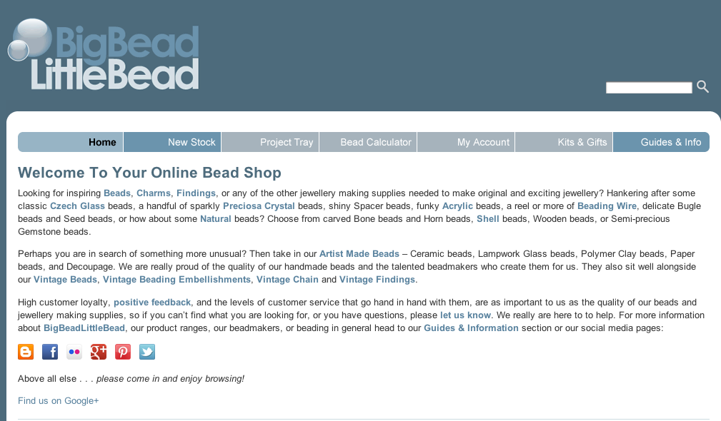
Big Bead Little Bead (henceforth known as BBLB) is a UK site that sell beads. So it’s a niche site, but it gets decent traffic. Here is their home page.
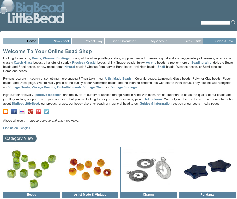
Now, what’s wrong with this? You can see the products (at least some of them). And the name of the business makes it pretty clear what they’re selling.
But visiting a site on a nice big monitor is not the same thing as visiting a site on a laptop, or even a tablet or mobile.
This is what I’d be looking at if was visiting Big Bead Little Bead’s site on a 10 inch laptop.
Oh dear. Suddenly every single one of the products has disappeared. (And it’s not much better on a 12 inch screen either – half the products are visible – as in, you can see the top half of the first line of products, but not the bottom half).
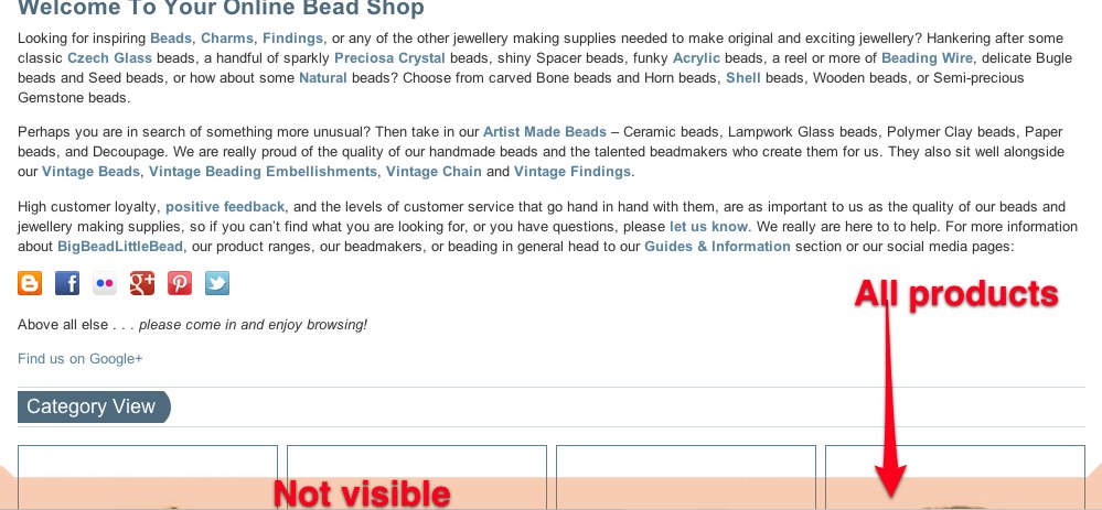
The key here is that all your products need to be “above the fold”. That is to say, you shouldn’t need to scroll down to see them. On the home page of BBLB for example, there are this many products ...
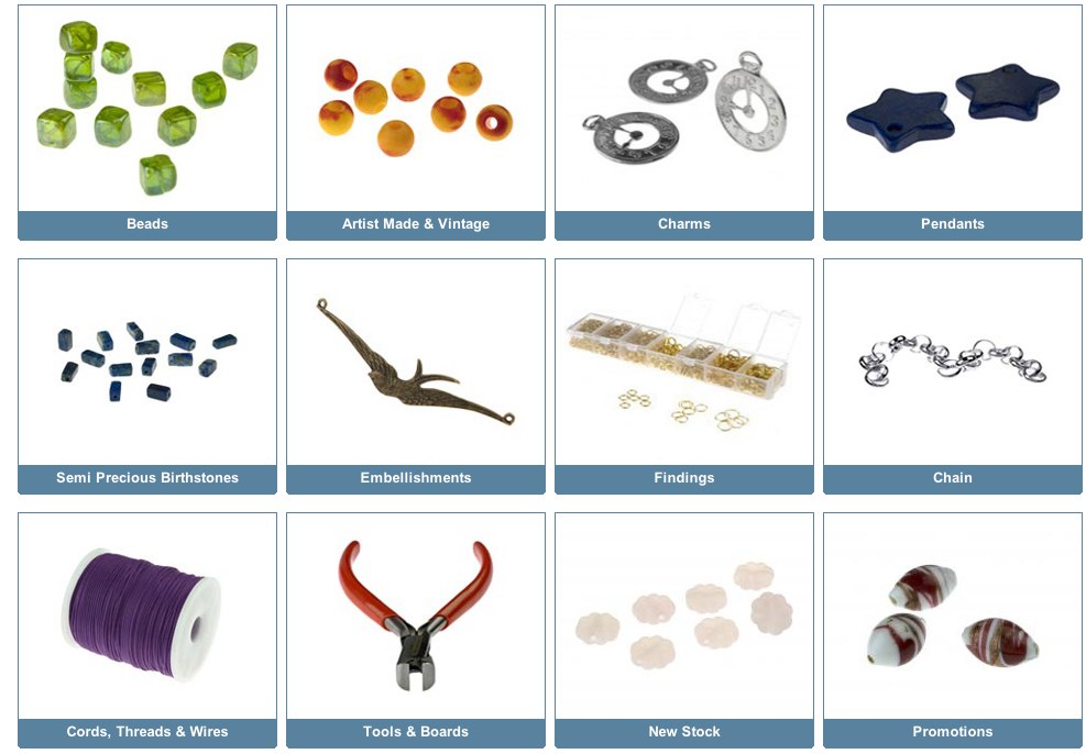
... but you can’t see them, even on a nice big screen like mine. This is a mistake.
Now, obviously different people will have different screens, and it’s easy to find out what screens your customers are using. We do this with Google Analytics.
So the first thing to do is log into your account.
Click on ‘In-Page Analytics’ in the content section, and notice the slider bar. And make sure that you’ve clicked ‘Browser size’.
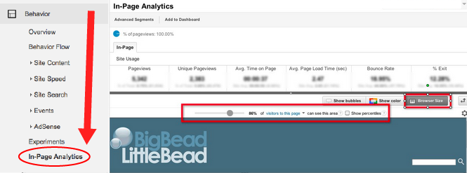
Now, scroll down so that you can see your home page, and move the sidebar left and right, to see how many people can see your content. (The content that people can’t see will be greyed, or rather pinked out.)
So if we set the slider to 10%, we can see that 10% of our visitors can see the first two rows of product. (They can see everything above this, but the pinkish shading represents the area they cannot.)
But move the scroller up to 50% and what do we see ...
... half of your website's visitors cannot see any products without scrolling down. That’s bad news.
If you don’t get many visitors to your site, this data may not be accurate. So to check what your website looks like in different screen sizes, there are loads of alternative to Google Analytics. I use Screenfly. It rocks.
If you don’t have the money or the time to create a website that adapts according to the screen size of the viewer (otherwise known as ‘responsive design’), at least experiment with your layout and make sure you don’t fall into the ‘below the fold trap’. Your users will thank you. As will your bank manager.
2) Make the next step clear
What would you, as a webmaster, like your customers to do when they’re on your home page? Whatever it is, make sure it’s blindingly obvious. So you could put a big ‘Buy Now’ button on your products, or maybe ‘Get in Touch’. You might have a newsletter, so you could have a ‘signup’ box (also, a great way of getting their contact details). Leave it in absolutely no doubt what your users should do next. Of course if you want them to part with their money, you need to be a bit persuasive.
Again, MailChimp and ASOS do this really well.
With MailChimp, they make it super-obvious where you should click if you want to buy. But they also have a little sales copy to encourage you. Not convinced? Well, they’ll give you the hard sell, but that’s on another page.
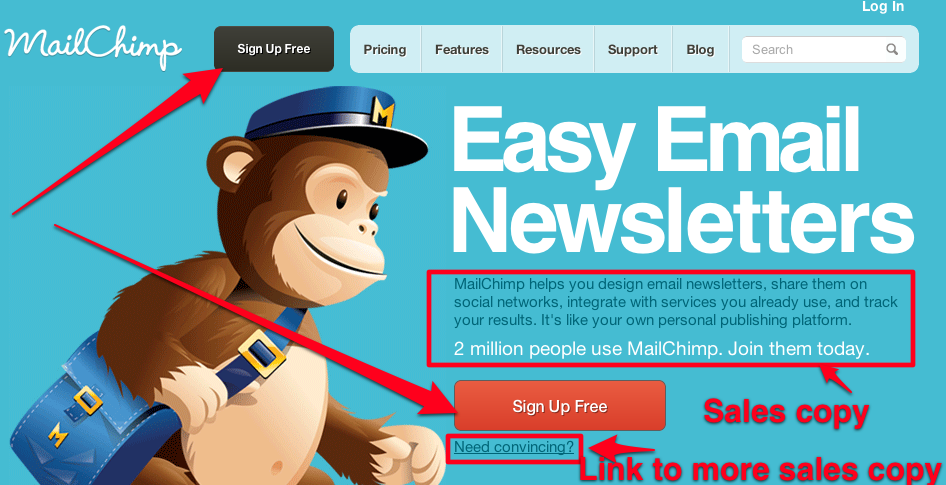
What I love about MailChimp is the confidence they demonstrate in their products. There’s no hard sell on the home page, because they know the basic idea is in itself compelling. There are just two sentences of sales copy. I LOVE this.
It’s sometimes difficult to summarize what your business does as succinctly as this. But try, because it will make your website much more compelling.
Brainstorm this with colleagues, maybe even ask your customers. And write everything down because it will help crystallize your thoughts.
And remember that what you come up with doesn’t need to be rocket science (unless of course, it is). No one is expecting you to be the next Google or Coca Cola. Look at what most retailers do. (And if you’re a retailer, this is where you have to pay attention). Retailers can’t use the home page to sell individual products (that’s what product pages are for), but what they can, and should do, is sell themselves. Here’s what I mean, courtesy of Asos. I‘ve added some red boxes - focus on these:
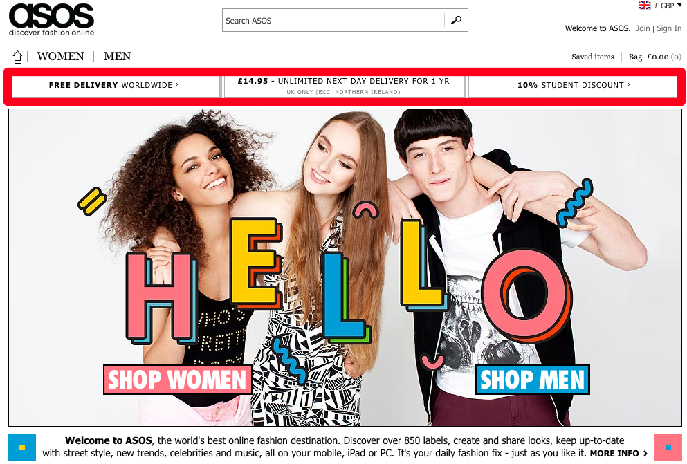
Free delivery worldwide, a premium delivery service and a 10% student discount. All these are reasons to shop with Asos and not a competitor. And all these are concise and to the point. There’s no waffle and they’re not bothered by the fact that their main selling points aren’t exactly ground-breaking.
If you’re a retailer and you have a sale on, the home page is a great place to talk about it. Everyone can see it, and everyone loves a bargain.
The exception to this rule is if, like Asos, you always have a sale on because you always need to get rid of underperforming stock. If this is you, copy the experts. Asos only advertise their sale with a tiny link on their product menu.
They do this to avoid ‘message fatigue’. If you always talk about the fact that you have a sale, there’s no urgency. People realize that you’ll be discounting your prices, so why hurry to purchase anything?
What we’re talking about here are the very basics of what’s called ‘conversion’ or simply, how many of your site’s visitors buy stuff. Promoting your product is the first step, but here are a few other things to consider:
a) Be disruptive.
A very linear, blocky site, like BBLB, where everything is aligned and there are lots of right angles, might be clear and even, but it’s very difficult to make anything stand out. This means users’ attention won’t be channeled towards your ‘call to action’. Use elements that break up alignments and hierarchies, and push your users’ eyes to where you want them to go. The more something sticks out, the more people will click on it.
b) Testify!
When someone buys something online, they have to hand over their money to a faceless website and trust the website to do its job. This is scary, especially if they’ve never used your website before.
As a webmaster, you need to do all you can to reassure your customers that you’re trustworthy. One of the easiest ways is with testimonials, quotes from people who have used, and liked, your service. A lot of companies ask for feedback automatically after a purchase is complete.
At Wordtracker for example, we have Disqus comments on all our blog. So if someone, like me, writes a load of rubbish, I get pulled up on it straight away. A lot of other companies use Facebook comments for the same purpose. Whatever you do, I‘d say, make sure there are views from your customers publicly available on your site.
There’s a debate about whether or not you should include negative feedback. Personally I would, because it shows that you’re responding to customers and you welcome feedback, but there are rather obvious downsides.
c) Make like James Cameron
You don’t need to produce the next blockbuster, but you should turn your hand to making a video or two. Videos, as well as being great content that search engines love, reassure your customers. They can see how the products are made, or get to know the faces of people behind the company. There are loads of different types of video you can produce to show off your company.
3) Open up your site
Not everyone who visits your site will buy something. Shocking, I know. But keep your navigation easy and intuitive so that your users still have a positive experience, and can find what they need easily. This will make them more likely to come back in future.
BBLB has great photos on its Facebook page and Pinterest boards. It would be great to see these images promoted more heavily on the main website.
I won’t show the MailChimp or Asos pages again but notice how many links there are from the home page. Whatever I want to do, whatever information I need, both these sites make it readily available.
Now, back to BBLB. All the links that I might need are all here, but some of them are hidden in long-copy text, which the top of your home page is not the place for. People don’t like reading lots of words on the web, especially not in one block like this.
And especially not on the home page, where we’re trying to get them to explore other parts of the site. But if you want to put some copy in for SEO purposes, put it below the fold, below the content that matters - your call to action or your products. It won’t make any (noticeable) difference to how search engines see your site, so they’ll still rank it well, but your users can get to the good stuff quickly.
So on to the subject of keywords. Make sure you put (some) keywords on your home page. This is often overlooked, but keywords will help your site rank, so make sure you include them, and their synonyms in the linking text, the navigation and in the copy where it’s relevant. (As well as the usual places, like title tags, h1 tags etc). I wonder where you can find popular keywords? Oh yeah, we do those :)
But before you go and radically shake up your home page, I have one more thing to say.
4) Remember the visual hierarchy
Some of the pages on your website will make you lots of money, others won’t. Navigation should always be easy and intuitive, but you can still nudge your users in the right direction. Don’t feel you have to treat all pages equally. You can make some pages easier to find than others.
I’m aware that throughout this article I’ve focused on the negatives of what BBLB were doing. That’s easy, but it’s not always helpful. So if I were BBLB, what would I do? Here are a few ideas.

Now, this obviously isn’t my site. The success or failure of this site won’t dictate whether or not I can pay my rent or keep the lights on. I can do whatever I like, because that’s the freedom objectivity offers. You’ll sadly have no such freedom with your site. There will be a lot at stake, so let me just explain what I’ve done and you can see if would work for your business.
1) I’ve added in a marketing slogan. Remember when I said that users should understand what your site is about in three seconds? Well, a slogan helps.
2) I’ve added a testimonial, to reassure people that I’m trustworthy.
3) And I’ve added a bestseller section. This is great SEO as it adds valuable links to the pages you want to rank, and makes the products more visible so you can sell more.
But there’s maybe a little more I’d do.
1) I’d make the social icons bigger, to make my content easier to share. (And I’d put the icons on the right hand side of the page, because more people will click them.)
2) I’d make the copy on the home page shorter, and more salesy.
3) Then I’d add in some disruptive elements to get people to click where I want them to. Maybe a nice big arrow pointing to the best sellers section?
There are lots of options.
For some more ideas, read our Landing page optimization article and check out Unbounce.com They have some fantastic landing page templates.
Priorities
What I’ve done here is highlight some best practices. I hope you’ll find them useful and give you some ideas about how you can develop your site. But I’m not suggesting that this is your road to business nirvana. You need to decide what changes you want to make to your site, and try to decide how much money those changes might make you. How does that compare with the other work you have planned?
The key with this is to work out what your priorities are. There will always be demands on your time. So you need to ask yourself constantly:
“What, of all the things I could do this week, is going to make me the most money?”
What’s your conversion rate right now? Why not make some of these changes and see how much it improves and how many more sales you can get?
Get a free 7-day trial
A subscription to Wordtracker's premium Keywords tool will help you to:
- Generate thousands of relevant keywords to improve your organic and PPC search campaigns.
- Optimize your website content by using the most popular keywords for your product and services.
- Research online markets, find niche opportunities and exploit them before your competitors.
Take a free 7-day trial of Wordtracker’s Keywords tool

Join the discussion
You can keep in contact with us on Google+, find us on Twitter. Facebook and LinkedIn