You know from your analytics data that customers are visiting your website: but they're not buying. Here's our list of 30 potential obstacles to that purchase (hopefully the first of many), along with suggestions on how to blast the obstacles to pieces.
First things first
Have a think about the things that annoy you when you're going through a checkout process. Next time you're ordering a book or a pair of shoes, focus your mind on how you would improve on someone else's procedure. Is it too confusing, too time-consuming and frustrating? If so, why? Take notes. You'll probably have seen some of the problems in our list.
30 Checkout Optimization problems and how to solve them
1) There are too many hoops to jump through
Your aim should be to make the shopping experience as quick and simple as possible. Removing unnecessary steps can help improve conversions.
2) You're forcing the customer to do something they really don't want to
Don't make it necessary to sign up for an account before your visitor can buy from you: you can ask them to do that afterwards. Provide a 'checkout as guest' option, like Walmart does:
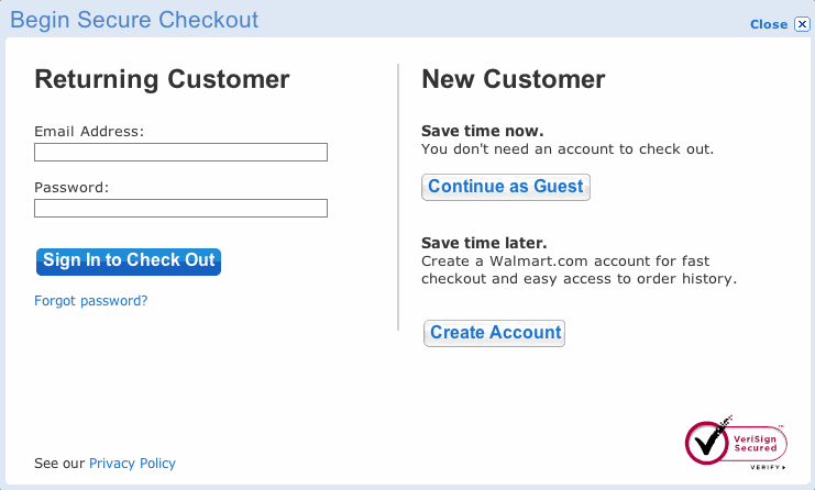
Amazon make you sign in, but that's because they're enormous and already have a very good reputation.
3) You're distracting potential buyers
By showing visitors additional items before they check out, they won't have any reason to leave your checkout page to go back hunting for them.
For example, upselling your customers a pink skin to go with their chosen iPod may increase revenue and turn out to be a useful item they'd forgotten they needed. But, do this before your visitor starts checking out.
With regard to support on delivery times, costs etc, implement pop-ups on the checkout page rather than linking off to a support page elsewhere on the site.
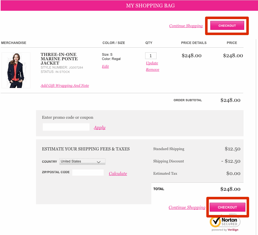
4) You haven't made it clear what to do next
Have a great big 'Proceed' or 'Confirm Order' button so your customer has no doubt what they should do next.
And try having another one on the opposite end of the page so that your visitor doesn't have to look far to find one:
Author and optimization expert Bryan Eisenberg suggests having a fancy-shaped button that stands out.
5) You've lost your customer in the labyrinth that is your site
Include a progress bar or checkout breadcrumbs so that your customer is in no doubt as to where they are in the process. Here's the one I see every week when I order my groceries online on Ocado.com:

You can even tell visitors how much more time they'll have to spend before they get to the end of their quest.
This survey of retailers' websites' progress bars at Pitstop Media may be useful to you.
6) You're making your potential customers fill in fields they've filled in dozens of times before
Make use of pre-populated fields on forms so your visitors don't have to rewrite the information that they've already filled in ten times that day.
7) Your website breaks
Make sure everything's working.
More than once I've had to abandon a transaction because the payment gateway has crashed, a link hasn't worked, or the website has crashed completely.
8) Aah - too much clutter!
Try a one-page checkout with dynamic forms and hidden elements (javascript) so that your page doesn't look cluttered. Conversion rates can improve with having just one page.
Sofa.com don't even need those hidden elements. All the information you need to fill in is on one page:
If you don't have in-house developers to do this for you, then checkout software such as Bigcommerce, Volusion and Magento offer the option either as a standard part of their package or as an optional extra.
9) You're giving your customers a census to complete
All forms should be easy to fill in and uncomplicated. You don't need your visitors' life stories. You can always email a survey at a later stage if you'd like to gather more information.
Here's a great article by Bryan Eisenberg on optimizing complicated forms so that they don't appear too intimidating.
10) You haven't made it clear what's missing/wrong
Take care how you report errors - a credit card field missing some numbers, or a password mismatch, for example.
Prevent head-scratching and repeated errors by making it clear what has gone wrong and how many errors there are on a page. By giving examples of what the correct format should be, or menus for addresses and dates you'll avoid many errors in the first place.
Here's a Smashing Magazine article on the subject of error validation
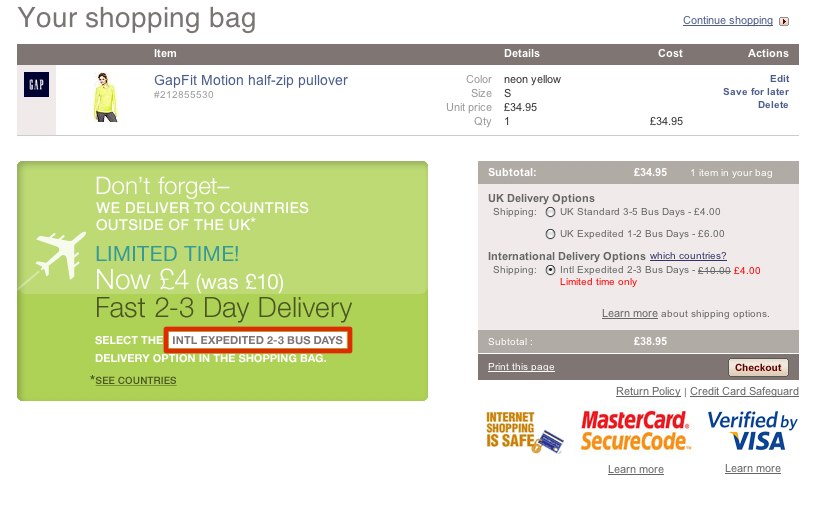
11) You haven't offered any money off
On your checkout page you show an empty discount code box. This will of course encourage your visitor to go elsewhere to find said code. If you do have a voucher/coupon box, make sure you disable it when you don't have an offer running.
Try showing the discount off price on your call to action button or on the checkout page.
Or add the information for any current offers to the checkout page itself. Here's a nice example from Gap:
12) Your buttons aren't saying what you think they are
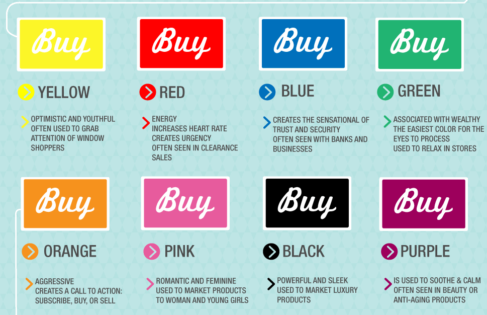
It's an old chestnut but the color of your buttons can make a difference. The online and analytics company Kissmetrics have produced an infographic on the psychology of color
Here's a section from the image on buying colors, but, as they say, color is experienced differently in different countries. This section applies to North American customers:
13) There's nothing to deliver
Of course you can make it even easier to check out, if there isn't a physical product to deliver. Get Elastic in this post on selling digital goods (mp3 files and the like) suggest that amongst other things ...
- You can easily provide a one page checkout page as no shipping address or choice of shipping is required.
- You should allow customers to add both physical and digital products to the same checkout basket, eliminating the need for separate checkout processes for each.
- You should provide assurances that your customer will be able to download as soon as the order has been placed, and give information on how to re-download later.
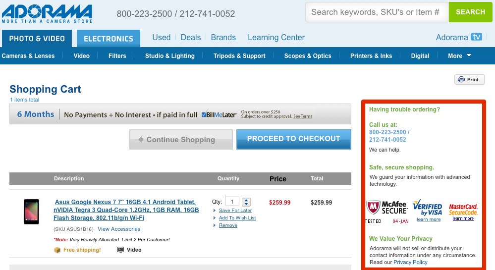
14) You could do more to look trustworthy
Engender trust: security certificates and logos; guarantees; https URLs; contact details; a pop-up privacy policy; a live chat slider that appears at the bottom of the screen. All of these measures will help reassure your visitor that you're an honest and decent company who won't rip them off.
Here's Adorama's checkout page:
15) Make sure your visitor knows exactly what they're buying
Include all relevant order details on the final checkout page so your customer doesn't have to press the back button to check something. Give them the option to print off these details from that page for their own or their boss's records.
16) The buy has completed everything you've asked them to, but their credit card type is wrong
Require users to choose their credit card - don't have the credit card type default to Amex or Mastercard. I know from my own experience that they might not notice that the card details they've entered don't match the default card type, causing the transaction to fail. You may never get a second chance to get them to complete the purchase.
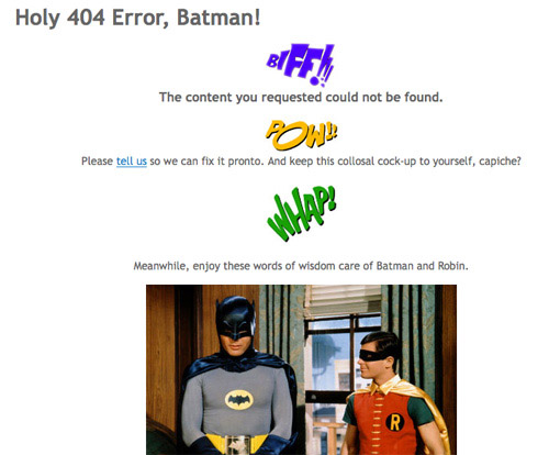
17) Don't be cheeky!
Don't have insulting error messages - I have actually seen "You've broken something" messages. Try something like this instead:
18) No-one wants nasty surprises
Don't act like a budget airline. Show delivery charges early and re-confirm the total costs at the end, setting out very clearly how the total amount is calculated.
Any nasty surprises will quickly cause your potential customer to disappear.
19) Your page speed is driving your visitor to distraction
Tend to your site speed. People get impatient and leave if it's taking minutes to do something. Read our article on speeding up your web pages
20) Your visitors aren't doing what you want them to do
Test different wordings on your call to action button.
The wording should fit in with the tone of your site and be confident without being pushy. Different markets respond differently to different words.
As we've mentioned before, you'll need to test.
21) Your purchaser has ordered three of the same thing by accident
Allow updates to quantities and make it obvious that the buyer needs to press the update button, or the total value won't change.
22) It needs to be sent directly to your customer's niece/nephew/wife/husband/dog
Include gift-wrap options or at the very least allow the purchaser to add a message.
Many years ago I went through a long telephone conversation ordering an item for a niece, only to find at the very end that they couldn't include a gift message. I had to abandon the whole thing and never ordered from them again.
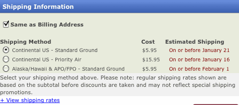
23) Your visitor doesn't want to spend a small fortune on next day delivery
Have multiple shipping options. Your potential customer may be willing to sacrifice speed for a less expensive purchase.
24) When is it being delivered?
Give an approximate delivery date. If a purchase is time-dependent, this could be a deal-breaker. Here's how Kohls.com do it.
25) You don't recognize your potential purchaser's address
Ensure your postcode entry/finder software is working and not too restrictive. If your user has a slightly unusual address it may be easier for them to simply enter it in themselves.
If something is wrong, don't display an error message with a phone number to ring if the system doesn't recognize a postal address, like John Lewis do:
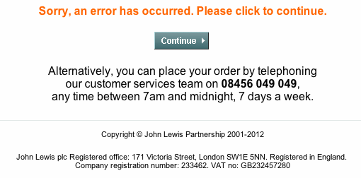
And they don't give you the chance to go back and enter the address manually. This potential customer (me) didn't buy from them.
26) Encourage further spending
Offer free shipping if over a certain amount is spent. Then present a progress bar showing how close the customer is to getting free shipping.
That way, you may just be able to sell more.
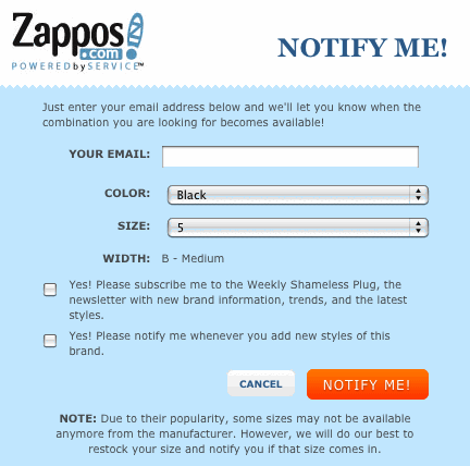
27) You've run out of stock
Don't let the customer get right through to checkout before telling them their item's out of stock. Be up-front about it on the product page and give them an option to register for a notification when it's back in stock:
28) Your visitor needs assistance and there's no-one there to help them
Offer communication by live chat software. Of course, not every company is going to be able to provide round the clock staff to man live chat, but having it available during working hours will discourage many visitors from leaving your site unconvinced.
29) Your potential purchaser has pressed the back button and broken the site
Try to make sure in the site's coding that that doesn't happen. Or if it's likely to, make it abundantly clear and provide the right link they should use in place of the back button.
30) You've led them right through the process only to tell them their session has timed out
Is this really necessary? If it is, warn your visitor rather than surprising them with the information after the timeout.
You'll need some third party advice
If in doubt about how easily (or not) your customers find navigating your checkout process, ask a friend to go through the steps and give some honest feedback. Preferably someone who's never used it before. Or try out a site like http://www.usertesting.com/ for some straight talking by strangers.
And have a look at this very funny Google video about how an average online checkout would look like in real life.
Optimization articles
Wordtracker have published three further page optimization articles:
There's no place like home (page)
Discover the secrets of a great landing page
NB: These are suggestions of improvements you can make to your checkout page to improve conversions. They won't all necessarily work for you and your market - the only way to check them out is to test and measure.
Get a free 7-day trial
A subscription to Wordtracker's premium Keywords tool will help you to:
- Generate thousands of relevant keywords to improve your organic and PPC search campaigns.
- Optimize your website content by using the most popular keywords for your product and services.
- Research online markets, find niche opportunities and exploit them before your competitors.
Take a free 7-day trial of Wordtracker’s Keywords tool