Data visualization is a simple concept. A statistic or data entry by their lonesome has very little significance and can be hard to understand. When paired together in bunches with other statistics and presented in revealing visuals, their true meaning is displayed. Using scatter plots, pie and bar graphs, heat maps, etc. are some of the best ways to draw attention to certain statistical anomalies or surprising patterns and observations that normally wouldn’t be clear by looking at just stats alone.
These tools can tremendously support any business’s digital marketing plan. They can use industry specific statistics, tap directly into target audiences, and convert them into product correlations not normally visible by raw data. The potential value of visualizing information is seemingly endless and utilizing it can create maps and pathways to future corporate success.
According to seo-hacker.com
“Sharing is caring in the case of data. It is important that all those involved see what is working…We are living in the age of transparency, and holding back this data is just as terrible as not getting it in the first place.”
With a considerable number of data visualization tools, figuring out the ones that work best for your business can be difficult. Here are a few that can prove to be beneficial.
Google Charts
Google Charts provides companies with impressive tools to create interactive charts for browsers and mobile devices. The varieties of choices range from simple pie charts or scatter plots, to hierarchical tree maps. Fully customizable configurations and HTML5/SVG cross-browser compatibility allow a large spectrum for potential uses and areas for brand growth. Some knowledge of JavaScript is required, but with help from experts in the industry, this challenge can easily be overcome. One of the best features is that Google Charts is free to use. If you’re a start-up or a growing business with a small budget, this might just be the tool for you.

https://developers.google.com/chart/
Raw
Raw is a highly customizable open sourced web application that creates vector-based visualizations and is built on the extensive D3.js JavaScript library. You can ensure your data will be safe, because Raw only processes your information through the web browser you are using and not through online servers.
Simply copy and paste data from your spreadsheet program like Google Sheets or Excel, to turn your information into fantastic visual representations. The Raw interface is clean and intuitive, so you don’t have to be an experienced programmer to use all of its features. The entire Raw process is straightforward and easy to carry out, with really nice results and lots of templates to choose from.

Canva
Canva is an online graphic design tool that makes it easy to design graphs, among many other things. With its free and highly customizable templates, users can easily and quickly make their data visually appealing for reports, presentations, social media graphics and documents.
For instance, if you need a pie chart, simply look for it under the elements tab, choose the pie illustration under graphs, input your data, then customize it according to the colors and styles that fit your brand or design. Aside from pie charts, there are other templates available for graph types including fishbone diagrams, Venn diagrams, flowcharts, strategy maps, and SWOT analyses.
https://www.canva.com/graphs/pie-charts/
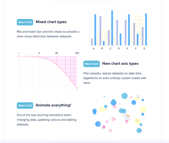
Tableau
One of the more highly diversified data visualization tools on the market is Tableau. The program is available in 5 forms (Tableau Desktop, Server, Online, Mobile, and Public) each with a considerable amount of different customization and design capabilities. Users can easily drag and drop data on to the platform and see their data become scatter plots or other forms of information models in real time. This tool provides a great deal of versatility and easy to use functions for users who are attempting to represent their data in the best ways possible.
Although Tableau offers a free version of their software, the paid edition grants users more capabilities and features. Another point to consider is that there is a learning curve for this tool, but they do provide support on their website. Tableau could easily be an applicable program to include in your business’s content strategy plan.
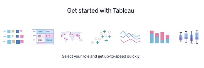
Chart.js
Using HTML5 elements to deliver responsive charts, Chart.js is a simple open source library that is the perfect data visualization tool for small business projects and hobbies.
Chart.js only supports six chart types - bar, line, polar, radar, pie and doughnut, so this software is really meant to be a quick fix for tasks that don’t require a substantial amount of information. If your company is working on a lower priority assignment that doesn’t have a demanding amount of data entry, Chart.js could be useful for you.
Leaflet
If your brand is looking for a simple open-source JavaScript library for interactive map data visualization, Leaflet is arguably the best option on the market. The mobile friendly application can help any business achieve geographical representations of their information. Leaflet like other open-sourced software, can help companies looking to grow their outreach.

Acquiring substantial amounts of useful data is nice and all, but being able to transform that information into visual representations can transform your business. Start using visualisation and show your data in a whole new light.