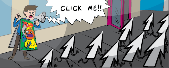
There is always a reason behind poor click-through rates (CTR) when it comes to banner ads. But sometimes it's hard to know where to start and which area to address first.
If the banner ad campaign you are currently using is not performing then you may want to look at your design. Getting a few variations on your banner design made up is something that's relatively cheap and you can easily split test your designs to find the most effective aesthetic for your purpose.
In this post, I'll look at a few of the ways poor design can impact on your CTR.
Who did you design the ad for?
When it comes to designing ads of any type, particularly for business owners without a lot of marketing experience, there is often an issue of who the ad is truly aimed at. Many tend to design an ad they themselves would like, one they would pay attention to. Another part of this is that you may be designing the ad with little thought to what people already know about your business. The one thing you cannot assume is that someone else knows anything about your company, its logo, and will recognize you. Certainly brand name companies like Coca Cola, Pepsi, M&M and others can use an ad that doesn’t say much about their brand. It is because they are multibillion dollar corporations with thousands of ads and commercials out there - the same can't be said for every business, particularly smaller enterprises.
For a smaller company creating a banner ad to gain sales, your design has to account for the clientele that may not know anything about you or what you offer.
To address this issue it helps to focus on the problem your product or service satisfies, that way viewers experiencing that issue will be compelled to click.
Call to action is design
Many of the ads seen today with a poor design also have a poor call to action. Thinking that a call to action is not part of the design of the ad is a misconception. You have to think about the design as a whole picture, including the text you use. A call to action is an inherent part of a banner ad design.
Think about what you're offering on the other side of the banner, is it a free demo, an experience, education or a special deal. This helps the viewer consider what they'll receive at the other end.
In addition to the wording you'll want to make sure the call to action placement is well considered and works well alongside other text and images. The call to action may be there, but if it is poorly disguised, or the person cannot see the link then they're not going to click through. You have to account for these things when you design an ad, and this is another point where split testing will reveal some great insight.
Quality versus low quality images
Many of the poorly constructed and designed banner ads have horrible, low quality images. This does not speak to the viewer at all - the person seeing the ad is just going to dismiss it. They see a low quality image and associate that low quality with the products or services you are trying to sell. A badly designed ad could be doing more harm than good.
This means you'll want quality content images and the right size and pixel ratio so that your images aren't blurry - or unnecessarily big.
The standard Leaderboard banner according to Designers Toolbox is 728px x 90px (the same ratio as the banner below) so there isn't enough space to fit a complicated image along with text and a clear call to action button, so keep it simple.
Improving the quality of your images will ensure that your ad is more appealing over all and give a good impression of your brand and product.
Leave behind the creative fonts
Even if a banner looks beautiful, that's no guarantee that it's readable. There are several fonts that are appealing in their appearance, but they can be tricky to read. These fonts might make the words too slim, or merge them together so they are just not properly readable. When you choose your font, you have to think about whether you can actually read what you see—not because your brain knows what is there, but because you can actually read it. There are fonts that are considered very easy to read, such as Verdana, Tahoma, Arial, Helvetica, and Futura. You also have to choose an appropriate size to the font such as 12 to 13.
In conclusion
It's important to consider all of your design elements when you're putting together a banner - from your target audience through to the colors, images and text you use to communicate not only your message but also your call to action. All of these together can make for a really strong campaign - and remember that testing different versions can give you a really strong insight into what the people your banner appears to want to engage with and can vastly increase your click-through rate.
It would be remiss to write a post about banner ads and not include one for good measure, and for this purpose www.20dollarbanners.com has the perfect example.
As you can see, this ad has clear copy and has a well balanced aesthetic. The picture is good quality, and all of the text is highly readable, while communicating the message clearly and quickly. There's an obvious call to action, and a viewer will be left in no doubt as to the purpose of the ad, or what to expect when they click through.

Let us know in the comments below what you're planning to do to improve your banner ad CTR.